I've been spending a lot of time chatting with developers about their biggest frustrations with CSS. Something that keeps coming up is z-index.
It's a deceptive little bugger of a property. It seems simple—the bigger number renders on top—but there's actually quite a lot more to it. I had been writing CSS for well over a decade, without realizing how this property actually works!
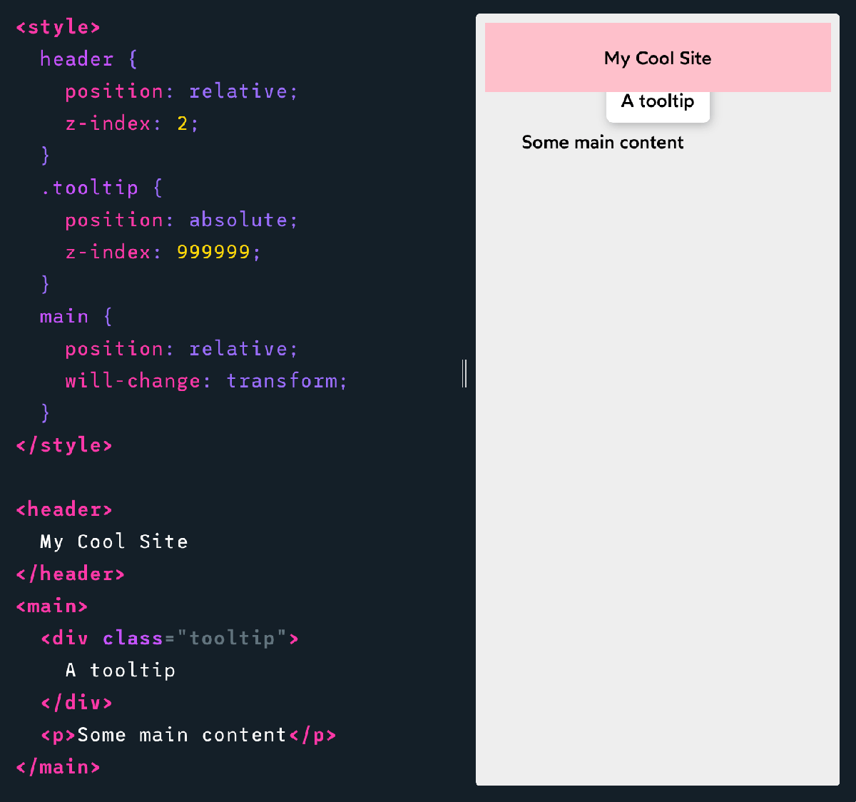
For example: did you know that z-index can work on elements that don't change the position property?
How about this one: can you figure out why .tooltip with a z-index of 999999 renders underneath a header with a z-index of 2?
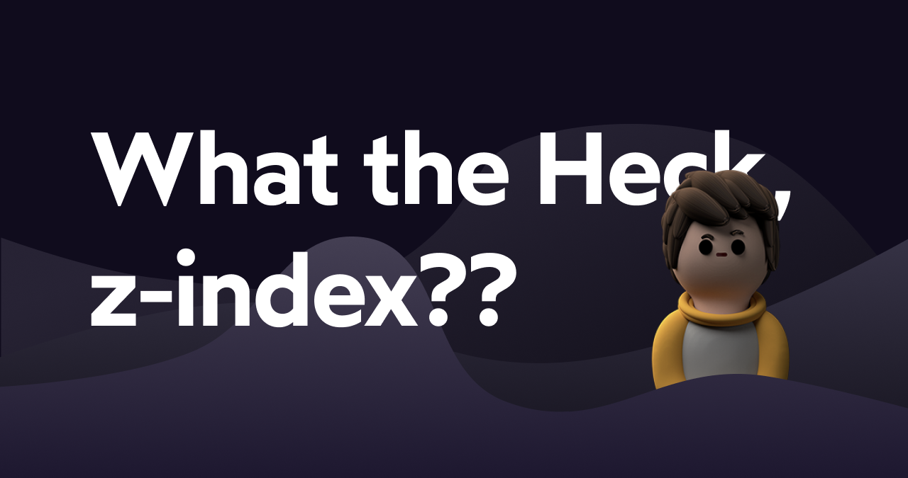
To help clarify some of these misconceptions, I've written a new blog post called “What the Heck, z-index??”, and I just published it. 😄
No matter how long you've been writing CSS, I suspect you'll have at least one eureka moment. Check it out:
A deep look at the hidden mechanic, stacking contexts, that help explain one of CSS' most misunderstood properties. We'll learn what it is, how it works, and how we can use it to our advantage, to cut down on z-index inflation.
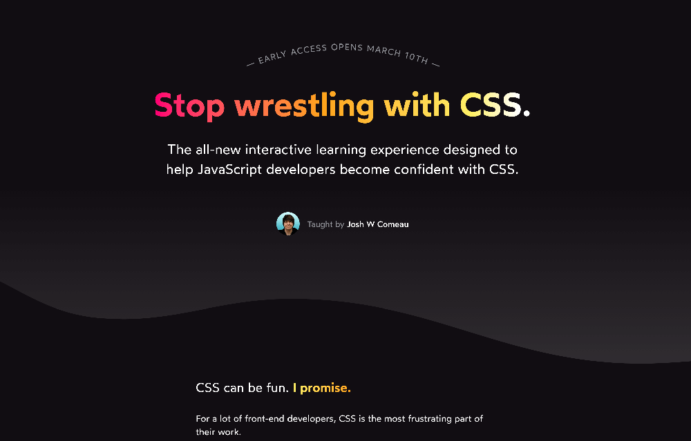
In preparation of the upcoming launch, I whipped up a new landing page! It features a healthy dollop of whimsical details:
The course enters Early Access on March 10th. Just a heads-up, registrations will only stay open for a week—registrations will reopen in the summer, when the course is fully complete.
The new landing page has a bunch of additional info for folks who are interested, including launch details, pricing information, and more.
Thoughts on CSS frameworks and stylized component libraries
A couple weeks back, I gave a talk for the UI.dev community. In the Q&A portion, I was asked for my opinion on "third-party styles" — tools like Bootstrap, Foundation, Ant Design, or Material UI.
It's an interesting question, and I thought I'd give a deeper answer in this newsletter! I'll warn you now, though; this answer got way longer than I expected 😅
The short version: I don't use them, and I don't think they should be used for most consumer-facing products.
I feel like there are 3 main reasons people reach for these tools:
They want their app/site to look good, and these tools are well-designed
They want to get something up and running quickly
They want to benefit from the battle-tested solutions to historical hard problems like modals, tooltips, and dropdowns.
These all sound like great things, right? How on earth could I be against them?
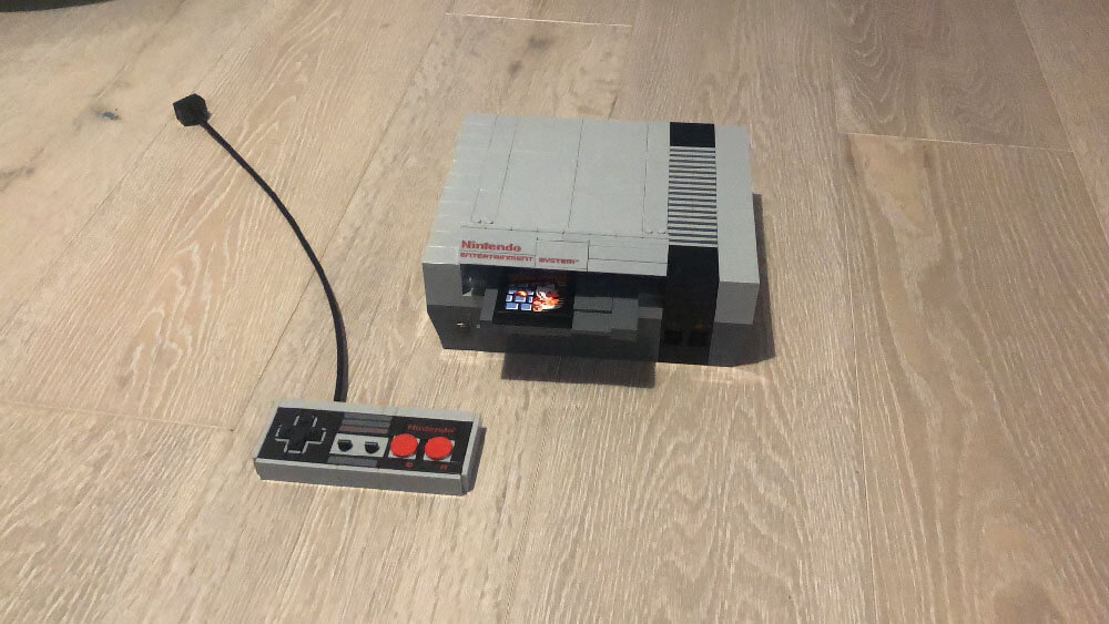
Over the holiday break this year, I had a ton of fun building a Lego Nintendo Entertainment System:
It was a really worthwhile kit. Highly recommended. When people are allowed to come over again, I look forward to people doing a double-take, confusing it for a real NES.
I want you to imagine, though, how good my NES would look if I had been given all the bricks, but none of the instructions. Not even shown a picture of the box. Could I assemble these bricks into the right shape?
No, I couldn't.
A design is more than the sum of its parts. Even if you have really nice bricks, it is hard to turn them into a cohesive, coherent final product.
The blocks in a design system like Material Design were built by a talented design team, and that team can assemble them into beautiful interfaces. We can use the same parts, but we won't achieve the same results.
To put it in more-practical terms: a good design requires balance, proper spacing, and a consistent aesthetic. Even when using third-party styles, you still have to make a ton of design decisions. Not to mention: these systems are never 100% complete. You'll need to mix and match your own components with these third-party ones, and it's very hard to make them "blend in".
It's not impossible to build a nice-looking app with third-party styles, but if you have the skills to do it, I'd wager you have the skills to do it without third-party styles too. Honestly, I think it'd be easier.
I really empathize with the desire to find a drop-in solution that "solves design", but honestly, I have yet to be convinced that it's possible.
For the past few years, I've taught web development fundamentals to bootcamp students at Concordia University. React is a big part of the curriculum.
The program ends with students picking their own final project, and building it over a number of weeks. The instructors, like me, offer guidance and help them get un-stuck.
We noticed a trend: students who pick a styling solution like react-bootstrap or Material UI get off the ground quickly, and make rapid progress in the first few days. But as time goes on, they get bogged down as the discrepancies between what they need and what the library offers becomes more apparent.
I remember one student spent a whole afternoon trying to modify the masthead from a CSS framework to support their navigation. In the end, they decided to scrap the third-party component, and they built an alternative themselves in 10 minutes.
Writing your own styles feels a bit to me like writing tests: it a bit slower at first, but that early effort pays off. In the long run, you'll save a lot of time and energy and frustration.
There are exceptions, and I'll discuss those shortly. But in general, I believe that these solutions actually take more time to use, even on relatively small projects.
CSS frameworks and component libraries typically include battle-tested versions of critical UI elements, things like modals and tooltips and dropdowns.
These elements are notoriously tricky to build properly, especially when considering accessibility.
To be clear, I do not advocate building modals from scratch. Please don't build your own modal. But do we really need to rely on a gigantic, styled component library for that?
There are tools that take a different approach. They solve the hard usability challenges associated with tricky UI elements without having an opinion about styles. My favourite tool in this category is Reach UI. There's also React Spectrum, a collection of tools from Adobe. Both treat accessibility as a first-class concern. They provide suites of components for things like modals/dialogs, comboboxes, dropdowns, and so on.
They're built with the intention of being wrapped in whatever styles you need. They focus on the functionality, and leave the styles up to you. This is the best of both worlds, in my opinion.
The two tools I listed are React-specific, but I believe there are solutions for other frameworks / vanilla JS. I just don't have experience with them, so I can't recommend any.
I shared a shorter version of this idea on Twitter, and a few people disagreed quite strongly with me.
The most compelling rebuttal was from Daniel Schutzsmith. He points out that frameworks have one big advantage: familiarity.
By using industry-standard tools like Bootstrap, they can hire developers already familiar with Bootstrap, instead of having to spend time training developers to learn the ins and outs of their bespoke component library.
And with CSS variables becoming more popular and well-supported, customizing these types of frameworks is a lot more feasible than it used to be.
I imagine that from the perspective of an agency that takes on a lot of short-to-medium-term projects, this could make a lot of sense. Projects can be cranked out using a familiar and robust system, and it could make hiring and onboarding easier if the developers already know how to use that system.
At least, that's the argument. I don't have enough agency experience to know if it's right or not.
I also think that component libraries have their place when it comes to building internal tools, prototypes, or things where quality and branding aren't critical. If you don't mind a cobbled-together aesthetic, there is an argument to be made for their speed!
Ultimately, though, for product companies, and for solo devs trying to build a project, I think it makes sense to skip Bootstrap and do it from scratch.
I know that both CSS and design are weak spots for many, but unfortunately, we can't outrun them with third-party styles. And I promise: if you spend some time investing in those skills, you'll be able to move quickly and build beautiful interfaces in less time and with less stress.
All of that said: this is just my take, based on my experience working in the industry and teaching students. I'm curious to know if your experience is different! Let me know (respectfully, please 😅) by replying to this email. I'm thinking of turning this into a blog post, and would really value any additional perspectives!
Thanks for reading all the way to the bottom 💖 I hope you have a good week (it's the last week in February, we've almost made it to Spring!!).
PS. I'm also curious to hear if the z-index tutorial I published today helped clarify things for you! Let me know 😄