The world of web animations has become a sprawling jungle of tools and technologies. Libraries like GSAP and Framer Motion and React Spring have sprung up to help us add motion to the DOM.
The most fundamental and critical piece, though, is the humble CSS transition. It's the first animation tool that most front-end devs learn, and it's a workhorse. Even the most grizzled, weathered animation veterans still reach for this tool often.
There's a surprising amount of depth to this topic. In this tutorial, we'll dig in and learn a bit more about CSS transitions, and how we can use them to create lush, polished animations.
Link to this headingThe fundamentals
The main ingredient we need to create an animation is some CSS that changes.
Here's an example of a button that moves on hover, without animating:
Code Playground
HTML
Result
This snippet uses the :hover pseudoclass to specify an additional CSS declaration when the user's mouse rests atop our button, similar to an onMouseEnter event in JavaScript.
To shift the element up, we use transform: translateY(-10px). While we could have used margin-top for this, transform: translate is a better tool for the job. We'll see why later.
By default, changes in CSS happen instantaneously. In the blink of an eye, our button has teleported to a new position! This is incongruous with the natural world, where things happen gradually.
We can instruct the browser to interpolate from one state to another with the aptly-named transition property:
Code Playground
Result
transition can take a number of values, but only two are required:
- The name of the property we wish to animate
- The duration of the animation
If you plan on animating multiple properties, you can pass it a comma-separated list:
.btn {
  transition:
    transform 250ms,
    opacity 400ms;
}

.btn:hover {
  transform: scale(1.2);
  opacity: 0;
}Link to this headingTiming functions
When we tell an element to transition from one position to another, the browser needs to work out what each "intermediary" frame should look like.
For example: let's say that we're moving an element from left to right, over a 1-second duration. A smooth animation should run at 60fpsFrames Per Second, the number of times the element is redrawn in a second, which means we'll need to come up with 60 individual positions between the start and end.
Let's start by having them be evenly-spaced:
Click me!

To clarify what's going on here: each faded circle represents a moment in time. As the circle moves from left to right, these are the frames that were shown to the user. It's like a flipbook.
In this animation, we're using a linear timing function. This means that the element moves at a constant pace; our circle moves by the same amount each frame.
There are several timing functions available to us in CSS. We can specify which one we want to use with the transition-timing-function property:
.btn {
  transition: transform 250ms;
  transition-timing-function: linear;
}
Or, we can pass it directly to the transition shorthand property:
.btn {
  transition: transform 250ms linear;
}
linear is rarely the best choice — after all, pretty much nothing in the real world moves this wayMaybe 3D printers come the closest? But if someone told us we danced like a 3D printer, we'd probably be offended. So we shouldn't aspire to this.. Good animations mimic the natural world, so we should pick something more organic!
Let's run through our options.
Link to this headingease-out
ease-out comes charging in like a wild bull, but it runs out of energy. By the end, it's pootering along like a sleepy turtle.
Try scrubbing with the timeline; notice how drastic the movement is in the first few frames, and how subtle it becomes towards the end.
If we were to graph the displacement of the element over time, it'd look something like this:
When would you use ease-out? It's most commonly used when something is entering from off-screen (eg. a modal appearing). It produces the effect that something came hustling in from far away, and settles in front of the user.
Link to this headingease-in
ease-in, unsurprisingly, is the opposite of ease-out. It starts slow and speeds up:
As we saw, ease-out is useful for things that enter into view from offscreen. ease-in, naturally, is useful for the opposite: moving something beyond the bounds of the viewport.
This combo is useful when something is entering and exiting the viewport, like a modal. We'll look at how to mix and match timing functions shortly.
Note that ease-in is pretty much exclusively useful for animations that end with the element offscreen or invisible; otherwise, the sudden stop can be jarring.
Link to this headingease-in-out
Next up, ease-in-out. It's the combination of the previous two timing functions:
This timing function is symmetrical. It has an equal amount of acceleration and deceleration.
I find this curve most useful for anything that happens in a loop (eg. an element fading in and out, over and over).
It's a big step-up over linear, but before you go slapping it on everything, let's look at one more option.
Link to this headingease
If I had a bone to pick with the CSS language authors when it comes to transitions, it's that ease is poorly named. It isn't descriptive at all; literally all timing functions are eases of one sort or another!
That nitpick aside, ease is awesome. Unlike ease-in-out, it isn't symmetrical; it features a brief ramp-up, and a lot of deceleration.
ease is the default value — if you don't specify a timing function, ease gets used. Honestly, this feels right to me. ease is a great option in most cases. If an element moves, and isn't entering or exiting the viewport, ease is usually a good choice.
Link to this headingCustom curves
If the provided built-in options don't suit your needs, you can define your own custom easing curve, using the cubic bézier timing function!
.btn {
  transition: transform 250ms cubic-bezier(0.1, 0.2, 0.3, 0.4);
}
All of the values we've seen so far are really just presets for this cubic-bezier function. It takes 4 numbers, representing 2 control points.
Bézier curves are really nifty, but they're beyond the scope of this tutorial. I'll be writing more about them soon though!
In the meantime, you can start creating your own Bézier timing functions using this wonderful helper from Lea Verou(opens in new tab):
Once you come up with an animation curve you're satisfied with, click “Copy” at the top and paste it into your CSS!
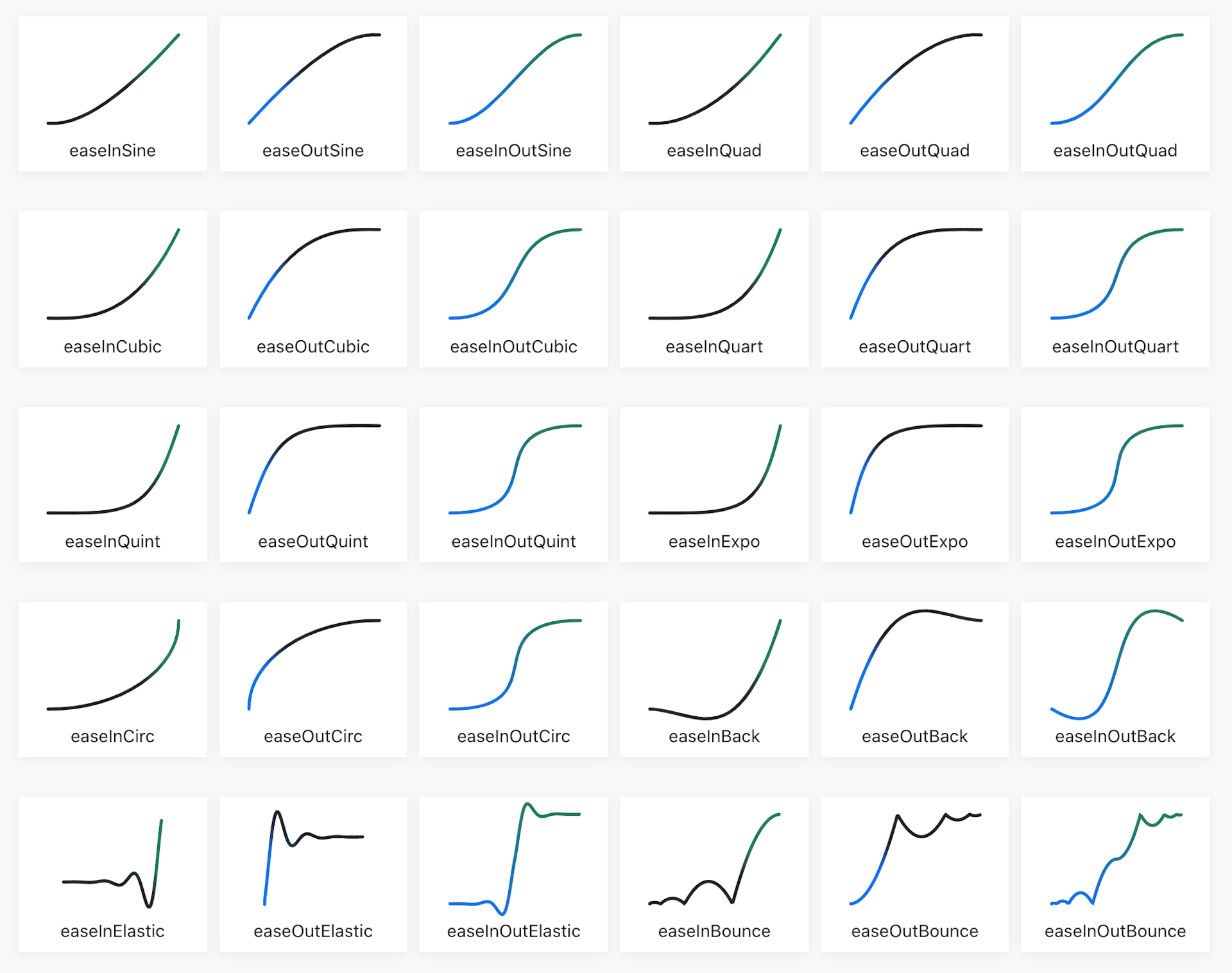
You can also pick from this extended set of timing functions(opens in new tab). Though beware: a few of the more outlandish options won't work in CSS.

When starting out with custom Bézier curves, it can be hard to come up with a curve that feels natural. With some practice, however, this is an incredibly expressive tool.
Link to this headingAnimation performance
Earlier, we mentioned that animations ought to run at 60fps. When we do the math, though, we realize that this means the browser only has 16.6 milliseconds to paint each frame. That's really not much time at all; for reference, it takes us about 100ms-300ms to blink!
If our animation is too computationally expensive, it'll appear janky and stuttery. Frames will get dropped, as the device can't keep up.
Experience this for yourself by tweaking the new "Frames per second" control:
In practice, poor performance will often take the form of variable framerates, so this isn't a perfect simulation.
Animation performance is a surprisingly deep and interesting area, well beyond the scope of this introductory tutorial. But let's cover the absolutely-critical, need-to-know bits:
- Some CSS properties are wayyy more expensive to animate than others. For example,
heightis a very expensive property because it affects layout. When an element's height shrinks, it causes a chain reaction; all of its siblings will also need to move up, to fill the space! - Other properties, like
background-color, are somewhat expensive to animate. They don't affect layout, but they do require a fresh coat of paint on every frame, which isn't cheap. - Two properties —
transformandopacity— are very cheap to animate. If an animation currently tweaks a property likewidthorleft, it can be greatly improved by moving it totransform(though it isn't always possible to achieve the exact same effect). - Be sure to test your animations on the lowest-end device that your site/app targets. Your development machine is likely many times faster than it.
If you're interested in learning more about animation performance, I gave a talk on this subject at React Rally. It goes deep into this topic:
Link to this headingHardware Acceleration
Depending on your browser and OS, you may have noticed a curious little imperfection in some of the earlier examples:

Pay close attention to the letters. Notice how they appear to glitch slightly at the start and end of the transition, as if everything was locking into place?
This happens because of a hand-off between the computer's CPU and GPU. Let me explain.
When we animate an element using transform and opacity, the browser will sometimes try to optimize this animation. Instead of rasterizing the pixels on every frame, it transfers everything to the GPU as a texture. GPUs are very good at doing these kinds of texture-based transformations, and as a result, we get a very slick, very performant animation. This is known as “hardware acceleration”.
Here's the problem: GPUs and CPUs render things slightly differently. When the CPU hands it to the GPU, and vice versa, you get a snap of things shifting slightly.
We can fix this problem by adding the following CSS property:
.btn {
  will-change: transform;
}
will-change is a property that allows us to hint to the browser that we're going to animate the selected element, and that it should optimize for this case.
In practice, what this means is that the browser will let the GPU handle this element all the time. No more handing-off between CPU and GPU, no more telltale “snapping into place”.
will-change lets us be intentional about which elements should be hardware-accelerated. Browsers have their own inscrutable logic around this stuff, and I'd rather not leave it up to chance.
There's another benefit to hardware acceleration: we can take advantage of sub-pixel rendering.
Check out these two boxes. They shift down when you hover/focus them. One of them is hardware-accelerated, and the other one isn't.
Code Playground
Result
It's maybe a bit subtle, depending on your device and your display, but one box moves much more smoothly than the other.
Properties like margin-top can't sub-pixel-render, which means they need to round to the nearest pixel, creating a stepped, janky effect. transform, meanwhile, can smoothly shift between pixels, thanks to the GPU's anti-aliasing trickery.
Link to this headingUX touches
Link to this headingAction-driven motion
Let's take another look at our rising “Hello World” button.
As it stands, we have a "symmetrical" transition — the enter animation is the same as the exit animation:
- When the mouse hovers over the element, it shifts up by 10 pixels over 250ms
- When the mouse moves away, the element shifts down by 10 pixels over 250ms
A cute little detail is to give each action its own transition settings. For hover animations, I like to make the enter animation quick and snappy, while the exit animation can be a bit more relaxed and lethargic:
Code Playground
HTML
CSS
Result
Another common example is modals. It can be useful for modals to enter with an ease-out animation, and to exit with a quicker ease-in animation:
This is a small detail, but it speaks to a much larger idea.
I believe most developers think in terms of states: for example, you might look at this situation and say that we have a “hover” state and a default state. Instead, what if we thought in terms of actions? We animate based on what the user is doing, thinking in terms of events, not states. We have a mouse-enter animation and a mouse-leave animation.
Tobias Ahlin shows how this idea can create next-level semantically-meaningful animations in his blog post, Meaningfun Motion with Action-Driven Animation(opens in new tab).
Link to this headingDelays
Well, we've come pretty far in our quest to become proficient with CSS transitions, but there are a couple final details to go over. Let's talk about transition delays.
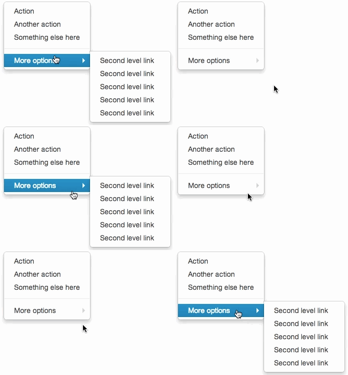
I believe that just about everyone has had this frustrating experience before:

As a developer, you can probably work out why this happens: the dropdown only stays open while being hovered! As we move the mouse diagonally to select a child, our cursor dips out-of-bounds, and the menu closes.
This problem can be solved in a rather elegant way without needing to reach for JS. We can use transition-delay!
.dropdown {
  opacity: 0;
  transition: opacity 400ms;
  transition-delay: 300ms;
}

.dropdown-wrapper:hover .dropdown {
  opacity: 1;
  transition: opacity 100ms;
  transition-delay: 0ms;
}
transition-delay allows us to keep things status-quo for a brief interval. In this case, when the user moves their mouse outside .dropdown-wrapper, nothing happens for 300ms. If their mouse re-enters the element within that 300ms window, the transition never takes place.
After 300ms elapses, the transition kicks in normally, and the dropdown fades out over 400ms.
Link to this headingDoom flicker
When an element is moved up or down on hover, we need to be very careful we don't accidentally introduce a "doom flicker":
Warning: This GIF includes flickering motion that may potentially trigger seizures for people with photosensitive epilepsy.
You may have noticed a similar effect on some of the demos on this page!
The trouble occurs when the mouse is near the element's boundary. The hover effect takes the element out from under the mouse, which causes it to fall back down under the mouse, which causes the hover effect to trigger again… many times a second.
How do we solve for this? The trick is to separate the trigger from the effect. Here's a quick example:
Code Playground
Result
Our <button> now has a new child, .background. This span houses all of the cosmetic styles (background color, font stuff, etc).
When we mouse over the plain-jane button, it causes the child to peek out above. The button, however, is stationary.
Try uncommenting the outline to see exactly what's going on!
Link to this headingRespecting motion preferences
When I see a well-crafted animation on the web, I react with delight and glee. People are different, though, and some folks have a very different reaction: nausea and malaise.
I've written before about respecting “prefers-reduced-motion”, an OS-level setting users can toggle to express a preference for less motion. Let's apply those lessons here, by disabling animations for folks who request it:
@media (prefers-reduced-motion: reduce) {
  .btn {
    transition: none;
  }
}
This small tweak means that animations will resolve immediately for users who have gone into their system preferences and toggled a checkbox.
As front-end developers, we have a certain responsibility to ensure that our products aren't causing harm. This is a quick step we can perform to make our sites/apps friendlier and safer.
Link to this headingThe bigger picture
CSS transitions are fundamental, but that doesn't mean they're easy. There's a surprising amount of depth to them; even in this long-winded blog post, I've had to cut some stuff out to keep it manageable!
Web animations are more important than most developers realize. A single transition here or there won't make or break an experience, but it adds up. In aggregate, well-executed animations can have a surprisingly profound effect on the overall user experience.
Transitions can make an app feel "real". They can offer feedback, and communicate in a more-visceral way than copy alone. They can teach people how to use your products. They can spark joy.
So, I have a confession to make: this tutorial was plucked straight from my CSS course, CSS for JavaScript Developers(opens in new tab). If you found this tutorial helpful, you should know that this is only the tip of the iceberg!
My course is designed to give you confidence with CSS. We explore how the language really works, building up a mental model you can use to solve any layout/UI challenge.
It's not like any other course you've taken. It's built on the same tech stack as this blog, and so there's lots of rich interactive content, but there are also bite-sized videos, tons of exercises, and real-world-inspired projects where you can test your knowledge. There are even some mini-games!
Learn more and see if you'd benefit from it at https://css-for-js.dev:
Finally, no interactive lesson is complete without a Sandbox Mode! Play with all the previous settings (and a couple new ones!) and create some generative art with this open-ended widget:
Last updated on
May 31st, 2025
