In my humble opinion, the best websites and web applications have a tangible “real” quality to them. There are lots of factors involved to achieve this quality, but shadows are a critical ingredient.
When I look around the web, though, it's clear that most shadows aren't as rich as they could be. The web is covered in fuzzy grey boxes that don't really look much like shadows.
In this tutorial, we'll learn how to transform typical box-shadows into beautiful, life-like ones:
Typical Shadow
Optimized Shadow
Link to this headingWhy even use shadows?
We'll get to the fun CSS trickery soon, I promise. But first, I wanna take a step back and talk about why shadows exist in CSS, and how we can use them to maximum effect.
Shadows imply elevation, and bigger shadows imply more elevation. If we use shadows strategically, we can create the illusion of depth, as if different elements on the page are floating above the background at different levels.
Here's an example. Drag the "Reveal" slider to see what I mean:
Are you sure?
This action cannot be undone.
I want the applications I build to feel tactile and genuine, as if the browser is a window into a different world. Shadows help sell that illusion.
There's also a tactical benefit here as well. By using different shadows on the header and dialog box, we create the impression that the dialog box is closer to us than the header is. Our attention tends to be drawn to the elements closest to us, and so by elevating the dialog box, we make it more likely that the user focuses on it first. We can use elevation as a tool to direct attention.
When I use shadows, I do it with one of these purposes in mind. Either I want to increase the prominence of a specific element, or I want to make my application feel more tactile and life-like.
In order to achieve these goals, though, we need to take a holistic view of the shadows in our application.
Link to this headingCreating a consistent environment
For a long time, I didn't really use shadows correctly 😬.
When I wanted an element to have a shadow, I'd add the box-shadow property and tinker with the numbers until I liked the look of the result.
Here's the problem: by creating each shadow in isolation like this, you'll wind up with a mess of incongruous shadows. If our goal is to create the illusion of depth, we need each and every shadow to match. Otherwise, it just looks like a bunch of blurry borders:
In the natural world, shadows are cast from a light source. The direction of the shadows depends on the position of the light:
In general, we should decide on a single light source for all elements on the page. It's common for that light source to be above and slightly to the left:

If CSS had a real lighting system, we would specify a position for one or more lights. Sadly, CSS has no such thing.
Instead, we shift the shadow around by specifying a horizontal offset and a vertical offset. In the image above, for example, the resulting shadow has a 4px vertical offset and a 2px horizontal offset.
Here's the first trick for cohesive shadows: every shadow on the page should share the same ratio. This will make it seem like every element is lit from the same light source.
Next, let's talk more about elevation. How can we create the illusion that an element is lifting up towards the user?
We'll need to tweak all 4 variables in tandem to create a cohesive experience.
Experiment with this demo, and notice how the values change:
The first two numbers—horizontal and vertical offset—scale together in tandem. The vertical offset is always 2x the horizontal one.
Two other things happen as the card rises higher:
- The blur radius gets larger.
- The shadow becomes less opaque.
(I'm also increasing the size of the card, for even more realism. In practice, it can be easier to skip this step.)
There are probably complex mathematical reasons for why these things happen, but we can leverage our intuition as humans that exist in a lit world.
If you're in a well-lit room, press your hand against your desk (or any nearby surface) and slowly lift up. Notice how the shadow changes: it moves further away from your hand (larger offset), it becomes fuzzier (larger blur radius), and it starts to fade away (lower opacity). If you're not able to move your hands, you can use reference objects in the room instead. Compare the different shadows around you.
Because we have so much experience existing in environments with shadows, we don't really have to memorize a bunch of new rules. We just need to apply our intuition when it comes to designing shadows. Though this does require a mindset shift; we need to start thinking of our HTML elements as physical objects.
So, to summarize:
- Each element on the page should be lit from the same global light source.
- The
box-shadowproperty represents the light source's position using horizontal and vertical offsets. To ensure consistency, each shadow should use the same ratio between these two numbers. - As an element gets closer to the user, the offset should increase, the blur radius should increase, and the shadow's opacity should decrease.
- You can skip some of these calculations by using our intuition.
Link to this headingThe tricks
Link to this headingLayering
Modern 3D illustration tools like Blender can produce realistic shadows and lighting by using a technique known as raytracing.

In raytracing, hundreds of beams of lights are shot out from the camera, bouncing off of the surfaces in the scene hundreds of times. This is a computationally-expensive technique; it can take minutes to hours to produce a single image!
Web users don't have that kind of patience, and so the box-shadow algorithm is much more rudimentary. It creates a box in the shape of our element, and applies a basic blurring algorithm to it.
As a result, our shadows will never look photo-realistic, but we can improve things quite a bit with a nifty technique: layering.
Instead of using a single box-shadow, we'll stack a handful on top of each other, with slightly-different offsets and radiuses:
Code Playground
Result
By layering multiple shadows, we create a bit of the subtlety present in real-life shadows.
This technique is described in detail in Tobias Ahlin's wonderful blog post, “Smoother and Sharper Shadows with Layered box-shadow(opens in new tab)”. Later in this blog post, I'll share some tools for coming up with these values programmatically!
Link to this headingColor-matched shadows
So far, all of our shadows have used a semi-transparent black color, like hsl(0deg 0% 0% / 0.4). This isn't actually ideal.
When we layer black over our background color, it doesn't just make it darker; it also desaturates it quite a bit.
Compare these two boxes:
Code Playground
Result
The box on the left uses a transparent black. The box on the right matches the color's hue and saturation, but lowers the lightness. We wind up with a much more vibrant box!
A similar effect happens when we use a darker color for our shadows:
Code Playground
Result
To my eye, neither of these shadows is quite right. The one on the left is too desaturated, but the one on the right is not desaturated enough; it feels more like a glow than a shadow!
It can take some experimentation to find the Goldilocks color:
Code Playground
Result
By matching the hue and lowering the saturation/lightness, we can create an authentic shadow that doesn't have that “washed out” grey quality.
Link to this headingPutting it all together
We've covered 3 distinct ideas in this tutorial:
- Creating a cohesive environment by coordinating our shadows.
- Using layering to create more-realistic shadows.
- Tweaking the colors to prevent “washed-out” gray shadows.
Here's an example that applies all of these ideas:
Code Playground
Result
Link to this headingProgrammatic tools
I built a tool that allows you to generate shadows that use these techniques. It's called “Shadow Palette Generator”. Check it out!
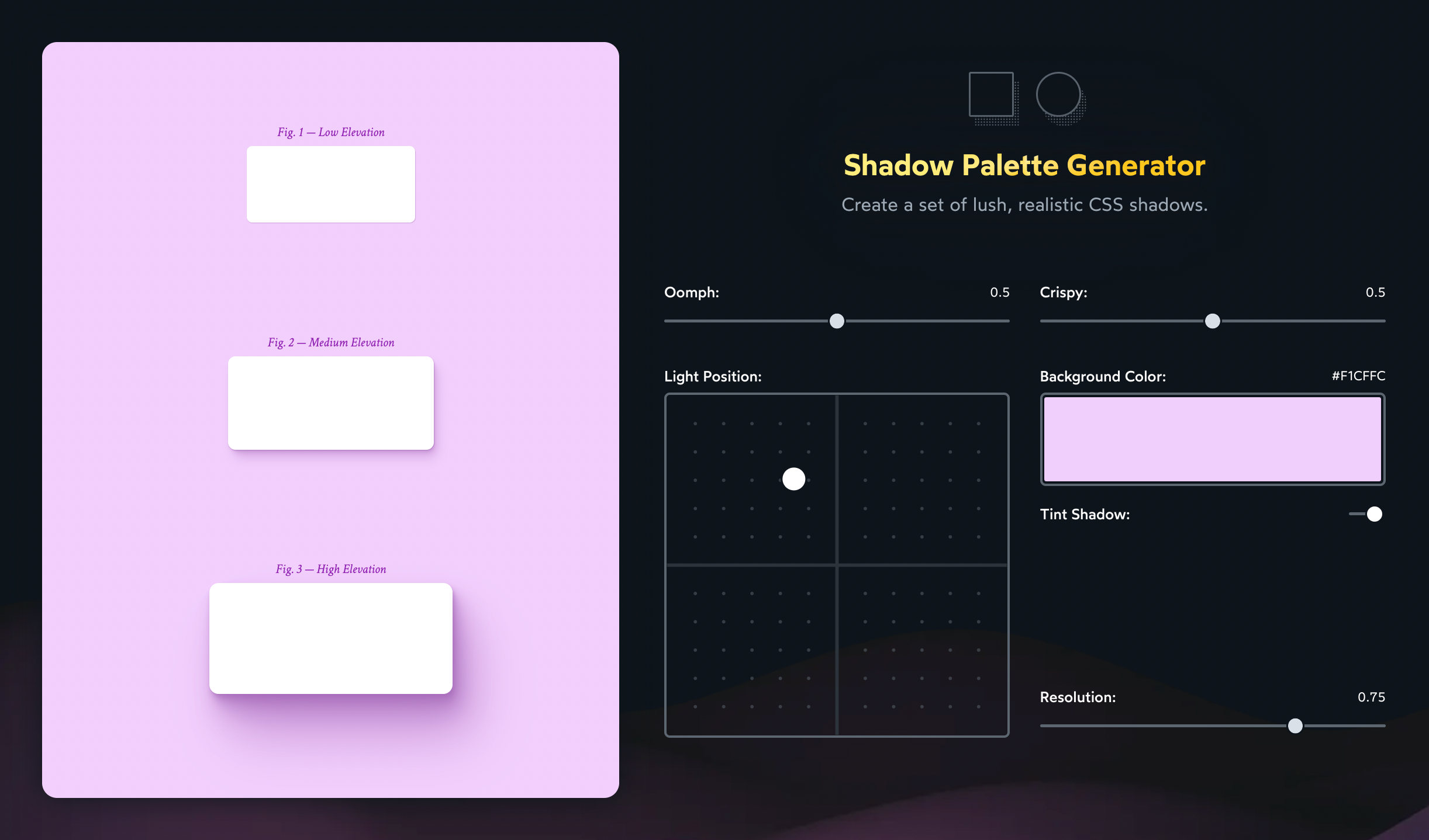
This tool was heavily inspired by Philipp Brumm's shadow tool, which is sadly no longer online.
Link to this headingFitting into a design system
The shadows we've seen need to be customized depending on their elevation and environment. This might seem counter-productive, in a world with design systems and finite design tokens. Can we really “tokenize” these sorts of shadows?
We definitely can! Though it will require the assistance of some modern tooling.
For example, here's how I'd solve this problem using React, styled-components, and CSS variables:
Code Playground
import styled from 'styled-components';
import './styles.css';

const ELEVATIONS = {
  small: `
    0.5px 1px 1px hsl(var(--shadow-color) / 0.7)
  `,
  medium: `
    1px 2px 2px hsl(var(--shadow-color) / 0.333),
    2px 4px 4px hsl(var(--shadow-color) / 0.333),
    3px 6px 6px hsl(var(--shadow-color) / 0.333)
  `,
  large: `
    1px 2px 2px hsl(var(--shadow-color) / 0.2),
    2px 4px 4px hsl(var(--shadow-color) / 0.2),
    4px 8px 8px hsl(var(--shadow-color) / 0.2),
    8px 16px 16px hsl(var(--shadow-color) / 0.2),
    16px 32px 32px hsl(var(--shadow-color) / 0.2)
  `
}

function App() {
  return (
    <>
      <Wrapper>
        <SubtleBox />
        <ElevatedBox />
      </Wrapper>
      <BlueWrapper>
        <SubtleBox />
        <ElevatedBox />
      </BlueWrapper>
    </>
  );
}

const Wrapper = styled.div`
  --shadow-color: 0deg 0% 50%;
  background-color: hsl(0deg 0% 95%);
  display: flex;
  flex-direction: column;
  align-items: center;
  gap: 16px;
  padding: 32px;
`
const BlueWrapper = styled(Wrapper)`
  --shadow-color: 220deg 60% 50%;
  background-color: hsl(220deg 100% 80%);
  padding: 32px;
`;

const Box = styled.div`
  border-radius: 8px;
  background: white;
`;
const SubtleBox = styled(Box)`
  width: 50px;
  height: 50px;
  box-shadow: ${ELEVATIONS.small};
`
const ElevatedBox = styled(Box)`
  width: 100px;
  height: 100px;
  box-shadow: ${ELEVATIONS.large};
`

export default App;
I have a static ELEVATIONS object, which defines 3 elevations. The color data for each shadow uses a CSS variable, --shadow-color.
Every time I change the background color (in Wrapper and BlueWrapper), I also change the --shadow-color. That way, any child that uses a shadow will automatically have this property inherited.
If you're not experienced with CSS variables, this might seem like total magic. This is just meant as an example, though; feel free to structure things differently!
Link to this headingContinue the journey
Earlier, I mentioned that my strategy for box shadows used to be “tinker with the values until it looks alright”. If I'm being honest, this was my approach for all of CSS. 😅
CSS is a tricky language because it's implicit. I learned all about the properties, stuff like position and flex and overflow, but I didn't know anything about the principles driving them, things like stacking contexts and hypothetical sizes and scroll containers.
In CSS, the properties are sorta like function parameters. They're the inputs used by layout algorithms and other complex internal mechanisms.
A few years back, I decided to take the time to learn how CSS really works. I went down MDN rabbit holes, occasionally drilling down all the way to the solid coreAKA the CSSWG specification. And when I'd run into one of those dastardly situations where things just didn't seem to make sense, I would settle into the problem, determined to poke at it until I understood what was happening.
This was not a quick or easy process, but by golly it was effective. All of a sudden, things started making so much more sense. CSS is a language that rewards those who go deep.
Near the start of the pandemic, I started thinking that maybe my experience could help expedite that process for other devs. After all, most of us don't have the time (or energy!) to spend years spelunking through docs and specs.
I left my job as a staff software engineer at Gatsby Inc., and I spent a year and a half building the ultimate CSS course. The course I wish I had, a few years ago.
It's called CSS for JavaScript Developers(opens in new tab), and it's a comprehensive interactive course that shows how CSS really works. It's specifically built for devs who use a JavaScript framework like React/Angular/Vue.

There are over 200 lessons, spread across 10 modules. And you've already finished one of them: this tutorial on shadow design was adapted from the course! Though, in the course, there are also videos and exercises and minigames.
If you find CSS confusing or frustrating, I want to help change that. You can learn more at css-for-js.dev(opens in new tab).
Josh is one of the brightest authorities on CSS out there, bringing both deep technical insights and a fantastic amount of whimsy to all his work. I highly recommend checking his course out if you're looking to level up!
 Addy OsmaniEngineering Manager at Google
I had seriously high expectations for Josh’s CSS course. And honestly? It's exceeded them. Even the first module is providing clarity on concepts I've used for years but never learned in detail. Mental models are essential, and I may finally have one for CSS.
 Laurie BarthSenior Software Engineer, Netflix
When I’m learning something from Josh, I know it’s being taught the best way it possibly could be. There’s no person I’d trust more to really install CSS into my brain.
 Adam WathanCreator of Tailwind CSS
Link to this headingBonus: drop-shadow
Throughout this tutorial, we've been using the box-shadow property. box-shadow is a great well-rounded tool, but it's not our only shadow option in CSS. 😮
Take a look at filter: drop-shadow:
Code Playground
HTML
CSS
Result
The syntax looks nearly identical, but the shadow it produces is different. This is because the filter property is actually a CSS hook into SVG filters. drop-shadow is using an SVG gaussian blur, which is a different blurring algorithm from the one box-shadow uses.
There are some other important differences between the two, but right now I wanna focus on drop-shadow's superpower: it contours the shape of the element.
For example, if we use it on an image with transparent and opaque pixels, the shadow will only apply to the opaque ones:

This works on images, but it also works on HTML elements! Check out how we can use it to apply a shadow to a tooltip that includes the tip:
Code Playground
Result
In many cases, drop-shadow is more performant than box-shadow, because the filter property can be hardware-accelerated, meaning that the GPU can manage it instead of the CPU. That said, this does depend on the browser: I've noticed that Safari in particular can struggle with drop-shadow. Specifically, it doesn't seem to like when a filter is applied to an element that contains a text input. It introduces a bit of input lag.
We're veering too far off-topic, but suffice it to say that the filter property is very compelling. I plan on writing more about it in the future. And, naturally, it's covered in depth in CSS for JavaScript Developers(opens in new tab)!
I hope this tutorial inspired you to add or tweak some shadows! Honestly, very few developers put this level of thought into their shadows. And it means that most users aren't used to seeing lush, realistic shadows. Our products stand out from the crowd when we put a bit more effort into our shadows.
Last updated on
August 17th, 2025