Flexbox is a remarkably powerful layout mode. When we truly understand how it works, we can build dynamic layouts that respond automatically, rearranging themselves as-needed.
For example, check this out:
This demo is heavily inspired by Adam Argyle’s incredible “4 layouts for the price of 1”(opens in new tab) codepen. It uses no media/container queries. Instead of setting arbitrary breakpoints, it uses fluid principles to create a layout that flows seamlessly.
Here's the relevant CSS:
form {
  display: flex;
  align-items: flex-end;
  flex-wrap: wrap;
  gap: 16px;
}
.name {
  flex-grow: 1;
  flex-basis: 160px;
}
.email {
  flex-grow: 3;
  flex-basis: 200px;
}
button {
  flex-grow: 1;
  flex-basis: 80px;
}
I remember running into demos like this and being completely baffled. I knew the basics of Flexbox, but this seemed like absolute wizardry!
In this blog post, I want to refine your mental model for Flexbox. We'll build an intuition for how the Flexbox algorithm works, by learning about each of these properties. Whether you're a CSS beginner, or you've been using Flexbox for years, I bet you'll learn quite a bit!
Let's do this!
Link to this headingIntroduction to Flexbox
CSS is comprised of many different layout algorithms, known officially as “layout modes”. Each layout mode is its own little sub-language within CSS. The default layout mode is Flow layout, but we can opt in to Flexbox by changing the display property on the parent container:
When we flip display to flex, we create a “flex formatting context”. This means that, by default, all children will be positioned according to the Flexbox layout algorithm.

So, what problem does Flexbox solve? Flexbox is all about arranging a group of items in a row or column, and giving us a ridiculous amount of control over the distribution and alignment of those items. As the name suggests, Flexbox is all about flexibility. We can control whether items grow or shrink, how the extra space is distributed, and more.
Link to this headingFlex direction
As mentioned, Flexbox is all about controlling the distribution of elements in a row or column. By default, items will stack side-by-side in a row, but we can flip to a column with the flex-direction property:
With flex-direction: row, the primary axis runs horizontally, from left to right. When we flip to flex-direction: column, the primary axis runs vertically, from top to bottom.
In Flexbox, everything is based on the primary axis. The algorithm doesn't care about vertical/horizontal, or even rows/columns. All of the rules are structured around this primary axis, and the cross axis that runs perpendicularly.
This is pretty cool. When we learn the rules of Flexbox, we can switch seamlessly from horizontal layouts to vertical ones. All of the rules adapt automatically. This feature is unique to the Flexbox layout mode.
The children will be positioned by default according to the following 2 rules:
- Primary axis: Children will be bunched up at the start of the container.
- Cross axis: Children will stretch out to fill the entire container.
Here's a quick visualization of these rules:


In Flexbox, we decide whether the primary axis runs horizontally or vertically. This is the root that all Flexbox calculations are pegged to.
Link to this headingAlignment
We can change how children are distributed along the primary axis using the justify-content property:
When it comes to the primary axis, we don't generally think in terms of aligning a single child. Instead, it's all about the distribution of the group.
We can bunch all the items up in a particular spot (with flex-start, center, and flex-end), or we can spread them apart (with space-between, space-around, and space-evenly).
For the cross axis, things are a bit different. We use the align-items property:
It's interesting… With align-items, we have some of the same options as justify-content, but there isn't a perfect overlap.
Why don't they share the same options? We'll unravel this mystery shortly, but first, I need to share one more alignment property: align-self.
Unlike justify-content and align-items, align-self is applied to the child element, not the container. It allows us to change the alignment of a specific child along the cross axis:
align-self has all the same values as align-items. In fact, they change the exact same thing. align-items is syntactic sugar, a convenient shorthand that automatically sets the alignment on all the children at once.
There is no justify-selfAt least, not in Flexbox. The property is implemented in the Grid layout mode.. To understand why not, we need to dig deeper into the Flexbox algorithm.
Link to this headingContent vs. items
So, based on what we've learned so far, Flexbox might seem pretty arbitrary. Why is it justify-content and align-items, and not justify-items, or align-content?
For that matter, why is there an align-self, but not a justify-self??
These questions get at one of the most important and misunderstood things about Flexbox. To help me explain, I'd like to use a metaphor.
In Flexbox, items are distributed along the primary axis. By default, they're nicely lined up, side-by-side. I can draw a straight horizontal line that skewers all of the children, like a Meat on a stick. AKA skewers, souvlaki, shish-kabob:

The cross axis is different, though. A straight vertical line will only ever intersect one of the children.
It's less like a kebab, and more like a group of Bite-sized hot dogs / vienna sausages:
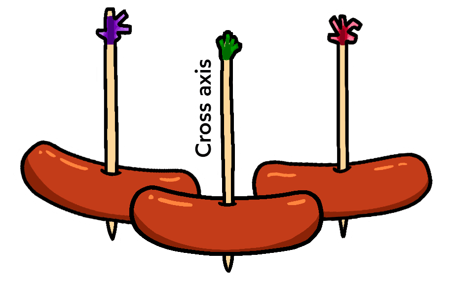
There's a significant difference here. With the cocktail wieners, each item can move along its stick without interfering with any of the other items:


 Drag me!


By contrast, with our primary axis skewering each sibling, a single item can’t move along its stick without bumping into its siblings! Try dragging the middle piece side to side:


This is the fundamental difference between the primary/cross axis. When we're talking about alignment in the cross axis, each item can do whatever it wants. In the primary axis, though, we can only think about how to distribute the group.
That's why there's no justify-self. What would it mean for that middle piece to set justify-self: flex-start? There's already another piece there!
With all of this context in mind, let's give a proper definition to all 4 terms we've been talking about:
justify— to position something along the primary axis.align— to position something along the cross axis.content— a group of “stuff” that can be distributed.items— single items that can be positioned individually.
And so: we have justify-content to control the distribution of the group along the primary axis, and we have align-items to position each item individually along the cross axis. These are the two main properties we use to manage layout with Flexbox.
There's no justify-items for the same reason that there's no justify-self; when it comes to the primary axis, we have to think of the items as a group, as content that can be distributed.
What about align-content? Actually, this does exist within Flexbox! We'll cover it a little later on, when we talk about the flex-wrap property.
Link to this headingHypothetical size
Let's talk about one of the most eye-opening realizations I've had about Flexbox.
Suppose I have the following CSS:
.item {
  width: 2000px;
}
A reasonable person might look at this and say: “alright, so we'll get an item that is 2000 pixels wide”. But will that always be true?
Let's test it:
Code Playground
Result
This is interesting, isn't it?
Both items have the exact same CSS applied. They each have width: 2000px. And yet, the first item is much wider than the second!
The difference is the layout mode. The first item is being rendered using Flow layout, and in Flow layout, width is a hard constraint. When we set width: 2000px, we'll get a 2000-pixel wide element, even if it has to burst through the side of the viewport like the Horrifying North American cartoon character known for bursting through walls.
In Flexbox, however, the width property is implemented differently. It's more of a suggestion than a hard constraint.
The specification has a name for this: the hypothetical size. It's the size an element would be, in a perfect utopian world, with nothing getting in the way.
Alas, things are rarely so simple. In this case, the limiting factor is that the parent doesn't have room for a 2000px-wide child. And so, the child's size is reduced so that it fits.
This is a core part of the Flexbox philosophy. Things are fluid and flexible and can adjust to the constraints of the world.
Link to this headingGrowing and shrinking
So, we've seen that the Flexbox algorithm has some built-in flexibility, with hypothetical sizes. But to really see how fluid Flexbox can be, we need to talk about 3 properties: flex-grow, flex-shrink, and flex-basis.
Let's look at each property.
Link to this headingflex-basis
I admit it: for a long time, I didn't really understand what the deal was with flex-basis. 😅
To put it simply: In a Flex row, flex-basis does the same thing as width. In a Flex column, flex-basis does the same thing as height.
As we've learned, everything in Flexbox is pegged to the primary/cross axis. For example, justify-content will distribute the children along the primary axis, and it works exactly the same way whether the primary axis runs horizontally or vertically.
width and height don't follow this rule, though! width will always affect the horizontal size. It doesn't suddenly become height when we flip flex-direction from row to column.
And so, the Flexbox authors created a generic “size” property called flex-basis. It's like width or height, but pegged to the primary axis, like everything else. It allows us to set the hypothetical size of an element in the primary-axis direction, regardless of whether that's horizontal or vertical.
Give it a shot here. Each child has been given flex-basis: 50px, but you can tweak the first child:
Like we saw with width, flex-basis is more of a suggestion than a hard constraint. At a certain point, there just isn't enough space for all of the elements to sit at their assigned size, and so they have to compromise, in order to avoid an overflow.
Link to this headingflex-grow
By default, elements in a Flex context will shrink down to their minimum comfortable size along the primary axis. This often creates extra space.
We can specify how that space should be consumed with the flex-grow property:
The default value for flex-grow is 0, which means that growing is opt-in. If we want a child to gobble up any extra space in the container, we need to explicitly tell it so.
What if multiple children set flex-grow? In this case, the extra space is divided proportionally between children based on their flex-grow value.
I think it'll be easier to explain visually. Try incrementing/decrementing each child:
The first child wants 1 unit of extra space, while the second child wants 1 unit. That means the total # of units is 2 (1 + 1). Each child gets a proportional share of that extra space.
Link to this headingflex-shrink
In most of the examples we've seen so far, we've had extra space to work with. But what if our children are too big for their container?
Let's test it. Try shrinking the container to see what happens:
- flex-basis
- 300px
- Reduced by:
- 0%
- flex-basis
- 150px
- Reduced by:
- 0%
Interesting, right? Both items shrink, but they shrink proportionally. The first child is always 2x the width of the second child.You might see some rounding issues that suggest it's off by a pixel or two. This is likely a flaw with my overengineered demo!
As a friendly reminder, flex-basis serves the same purpose as width. We'll use flex-basis because it's conventional, but we'd get the exact same result if we used width!
flex-basis and width set the elements' hypothetical size. The Flexbox algorithm might shrink elements below this desired size, but by default, they'll always scale together, preserving the ratio between both elements.
Now, what if we don't want our elements to scale down proportionally? That's where the flex-shrink property comes in.
Take a couple of minutes and poke at this demo. See if you can figure out what's going on here. We'll explore below.
- flex-basis
- 250px
- flex-shrink
- 1
- Reduced by:
- 0%
- flex-basis
- 250px
- flex-shrink
- 1
- Reduced by:
- 0%
Alright, so: we have two children, each with a hypothetical size of 250px. The container needs to be at least 500px wide to contain these children at their hypothetical size.
Let's suppose we shrink the container to 400px. Well, we can't stuff 500px worth of content into a 400px bag! We have a deficit of 100px. Our elements will need to give up 100px total, in order for them to fit.
The flex-shrink property lets us decide how that balance is paid.
Like flex-grow, it's a ratio. By default, both children have flex-shrink: 1, and so each child pays ½ of the balance. They each forfeit 50px, their actual size shrinking from 250px to 200px.
Now, let's suppose we crank that first child up to flex-shrink: 3:
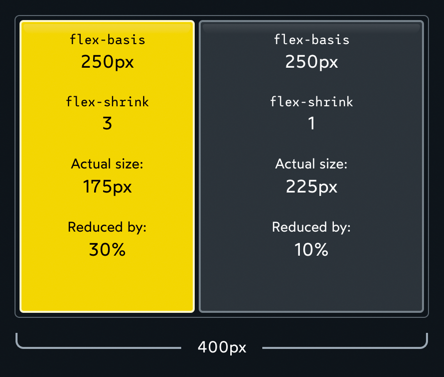
We have a total deficit of 100px. Normally, each child would pay ½, but because we've tinkered with flex-shrink, the first element winds up paying ¾ (75px), and the second element pays ¼ (25px).
Note that the absolute values don't matter, it's all about the ratio. If both children have flex-shrink: 1, each child will pay ½ of the total deficit. If both children are cranked up to flex-shrink: 1000, each child will pay 1000/2000 of the total deficit. Either way, it works out to the same thing.
I had an epiphany a while back about flex-shrink: we can think of it as the “inverse” of flex-grow. They're two sides of the same coin:
flex-growcontrols how the extra space is distributed when the items are smaller than their container.flex-shrinkcontrols how space is removed when the items are bigger than their container.
This means that only one of these properties can be active at once. If there's extra space, flex-shrink has no effect, since the items don't need to shrink. And if the children are too big for their container, flex-grow has no effect, because there's no extra space to divvy up.
I like to think of it as two separate realms. You're either on Earth, or in the The evil alternative dimension from Stranger Things. Each world has its own rules.
Link to this headingPreventing shrinking
Sometimes, we don't want some of our Flex children to shrink.
I notice this all the time with SVG icons and shapes. Let's look at a simplified example:
When the container gets narrow, our two circles get squashed into gross ovals. What if we want them to stay circular?
We can do this by setting flex-shrink: 0:
When we set flex-shrink to 0, we essentially “opt out” of the shrinking process altogether. The Flexbox algorithm will treat flex-basis (or width) as a hard minimum limit.
Here's the full code for this demo, if you're curious:
Flex Shrink ball demo
Result
Link to this headingThe minimum size gotcha
There's one more thing we need to talk about here, and it's super important. It may be the single most helpful thing in this entire article!
Let's suppose we're building a fluid search form for an e-commerce store:
When the container shrinks below a certain point, the content overflows!
But why?? flex-shrink has a default value of 1, and we haven't removed it, so the search input should be able to shrink as much as it needs to! Why is it refusing to shrink?
Here's the deal: In addition to the hypothetical size, there's another important size that the Flexbox algorithm cares about: the minimum size.
The Flexbox algorithm refuses to shrink a child below its minimum size. The content will overflow rather than shrink further, no matter how high we crank flex-shrink!
Text inputs have a default minimum size of 170px-200px (it varies between browsers). That's the limitation we're running into above.
In other cases, the limiting factor might be the element's content. For example, try resizing this container:
For an element containing text, the minimum width is the length of the longest unbreakable string of characters.
Here's the good news: We can redefine the minimum size with the min-width property.
By setting min-width: 0px directly on the Flex child, we tell the Flexbox algorithm to overwrite the “built-in” minimum width. Because we've set it to 0px, the element can shrink as much as necessary.
This same trick can work in Flex columns with the min-height property (although the problem doesn't seem to come up as often).
Link to this headingGaps
One of the biggest Flexbox quality-of-life improvements in recent years has been the gap property:
gap allows us to create space in-between each Flex child. This is great for things like navigation headers:
gap is a relatively new addition to the Flexbox language, but it's been implemented across all modern browsers(opens in new tab) since early 2021.
Link to this headingAuto margins
There's one other spacing-related trick I want to share. It's been around since the early days of Flexbox, but it's relatively obscure, and it blew my mind when I first discovered it.
The margin property is used to add space around a specific element. In some layout modes, like Flow and Positioned, it can even be used to center an element, with margin: auto.
Auto margins are much more interesting in Flexbox:
Earlier, we saw how the flex-grow property can gobble up any extra space, applying it to a child.
Auto margins will gobble up the extra space, and apply it to the element's margin. It gives us precise control over where to distribute the extra space.
A common header layout features the logo on one side, and some navigation links on the other side. Here's how we can build this layout using auto margins:
Code Playground
Result
The Corpatech logo is the first list item in the list. By giving it margin-right: auto, we gather up all of the extra space, and force it between the 1st and 2nd item.
We can see what's going on here using the browser devtools:
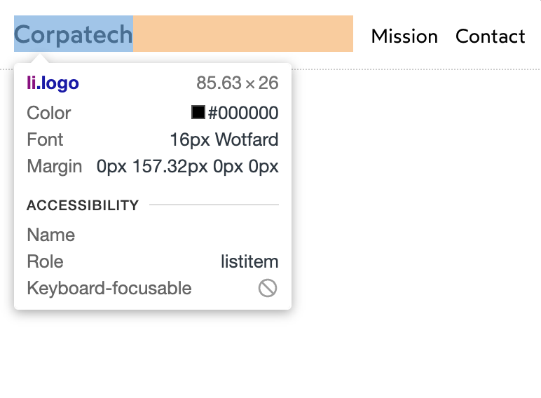
There are lots of other ways we could have solved this problem: we could have grouped the navigation links in their own Flex container, or we could have grown the first list item with flex-grow. But personally, I love the auto-margins solution. We're treating the extra space as a resource, and deciding exactly where it should go.
Link to this headingWrapping
Phew! We've covered a lot of stuff so far. There's just one more big takeaway I want to share.
So far, all of our items have sat side-by-side, in a single row/column. The flex-wrap property allows us to change that.
Check it out:
- flex-basis
- 180px
- flex-basis
- 180px
- flex-basis
- 180px
Most of the time when we work in two dimensions, we'll want to use CSS Grid, but Flexbox + flex-wrap definitely has its uses! This particular example showcases the “deconstructed pancake”(opens in new tab) layout, where 3 items stack into an inverted pyramid on mid-sized screens.
When we set flex-wrap: wrap, items won't shrink below their hypothetical size. At least, not when wrapping onto the next row/column is an option!
But wait! What about our kebab / cocktail weenie metaphor??
With flex-wrap: wrap, we no longer have a single primary axis line that can skewer each item. Effectively, each row acts as its own mini flex container. Instead of 1 big skewer, each row gets its own skewer:

All of the rules we've learned so far continue to apply, within this reduced scope. justify-content, for example, will distribute the two pieces on each stick.
But hmm... How does align-items work, now that we have multiple rows? The cross axis could intersect multiple items now!
Take a moment to consider. What do you think will happen when we change this property? Once you have your answer (or at least an idea), see if it's right:
Each row is its own mini Flexbox environment. align-items will move each item up or down within the invisible box that wraps around each row.
But what if we want to align the rows themselves? We can do that with the align-content property:
To summarize what's happening here:
flex-wrap: wrapgives us two rows of stuff.- Within each row,
align-itemslets us slide each individual child up or down - Zooming out, however, we have these two rows within a single Flex context! The cross axis will now intersect two rows, not one. And so, we can't move the rows individually, we need to distribute them as a group.
- Using our definitions from above, we're dealing with content, not items. But we're also still talking about the cross axis! And so the property we want is
align-content.
Link to this headingYou made it!
So I want to acknowledge something: this has been a dense tutorial. We've gone way down the rabbit hole, and unless you're already a Flexbox pro, I expect your head is spinning a bit. 😅
Like so much in CSS, Flexbox might seem simple when you first get started, but the complexity ramps up quickly when you get beyond the basics.
As a result, so many of us hit an early plateau with CSS. We know enough to get things done, but it's a constant struggle. The language feels rickety and unpredictable, like an ancient rope bridge that could give out at any second. When it snaps, we hurl random StackOverflow snippets at the problem, hoping something will help.
It's no fun. And that sucks, since CSS is a pretty big part of most front-end dev jobs!
The thing is, CSS is actually a deeply robust and consistent language. The problem is that most of our mental models are incomplete and inaccurate. When we take the time to build a proper intuition for the language, things start to click, and CSS becomes an absolute joy to use. ✨
My solution to this problem is a comprehensive course called CSS for JavaScript Developers(opens in new tab).

If you found this blog post helpful, you'll love the course. It follows a similar approach, but for the entire CSS language, and with exercises and projects to make sure you're actually developing new skills.
It's specifically built for folks who use a JS framework like React/Angular/Vue. 80% of the course focuses on CSS fundamentals, but we also see how to integrate those fundamentals into a modern JS application, how to structure our CSS, stuff like that.
If you struggle with CSS, I hope you'll check it out. Gaining confidence with CSS is game-changing, especially if you're already comfortable with HTML and JS. When you complete the holy trinity, it becomes so much easier to stay in flow, to truly enjoy developing web applications.
You can learn more here:
Link to this headingBonus: Unpacking the demo
At the start of this tutorial, we saw the following “4 layouts for the price of 1” demo:
Now that we've learned all about the Flexbox algorithm, can you figure out how this works? Feel free to experiment with the code here:
Code Playground
Result
Let's walk through how this works:
Thanks so much for reading! This blog post was a ton of work, and I'm thrilled to have it out in the world! I hope you found it useful. 💖
Last updated on
May 9th, 2025