So here's a CSS linear gradient, going from pure yellow to pure blue:
Notice that it gets kinda washed out and muddy in the middle there?
This is what Erik Kennedy has coined the “gray dead zone”. Unless you're really careful when selecting colors for your gradients, you'll often wind up with a desaturated midsection in your CSS gradients.
As it turns out, though, we can absolutely avoid the gray dead zone. In this blog post, we're going to learn about why this happens, and how we can use color theory to create rich, vivid, thoroughly-alive gradients.
Link to this headingHow gradients are calculated
Have you ever wondered how the CSS linear-gradient algorithm works? How does it actually calculate the specific color value for every pixel along the spectrum?
It figures it out by taking the mathematical average for each of the 3 color channels: Red, Green, and Blue.
Click and drag to see the specific RGB breakdown for every pixel along the way:
How to use: Click and drag to reposition the indicator, or focus the indicator and use the left/right arrow keys.
In the RGB color space, we create colors by mixing three channels: red, green, and blue. Each channel has a range from 0 to 255.
If we max out all three channels — 255 / 255 / 255 — we get pure white. And if we set each channel to 0, we get black, the absence of any color.
In fact, if all 3 channels are set to the same value, the result will always be a grayscale color:
In the demo above, we start at pure yellow (255/255/0). As we move through the gradient, we start mixing in the blue (0/0/255). By the time we reach the very center, we've mixed out half of the yellow, and mixed in half of the blue.
In other words, all three channels converge towards their middle value, 127.5. And the resulting color is gray.
It's a bit weird to me that the midpoint between blue and yellow is gray. By mixing two highly-saturated colors together, we wind up with a totally-desaturated color. What if there was a way to mix only the pigment, and keep the saturation consistent throughout?
Link to this headingAlternative color modes
There are lots of different ways to represent color. So far, we've been using the R/G/B mode. And, honestly, this color mode kinda sucks. 😅
Let's talk about a different color mode: HSL.
HSL stands for Hue / Saturation / Lightness. If you've ever used a color picker, you've probably worked with this color mode.Technically, most color pickers use the HSB mode rather than HSL, but they're very similar
Here's a live example:
- Hue
- 0 degrees
Here's what each value represents:
- Hue controls what the pigment will be, where the color falls on the color wheel.
- Saturation controls how vibrant the color will be.
- Lightness controls how light or dark the color is.
Personally, I find that this is a much more intuitive way to think about color.
Here's the really magical thing: what if, instead of averaging out the RGB values in our gradients, we average out the HSL values?
Well, let's try it:
There's no more gray dead zone, because we're not mixing R/G/B values anymore, we're mixing H/S/L values.
The start color and end color share the same saturation and lightness, and so the only value that changes is the hue. As a result, we're effectively walking through the color wheel.
Here's another example, this time mixing colors with different saturations and lightnesses:
And here are the same colors, using typical RGB mixing:
Quite a difference, right?
Now, HSL isn't necessarily the best color mode to use in every situation; it tends to produce gradients that can be overly bright and vivid, because it doesn't take into account human perception.
According to the HSL color mode, both of these colors share the same “lightness”:
Not everyone sees color the same way, but most people will say that the yellow feels a lot lighter than the blue, despite them having the same "lightness" value. HSL isn't concerned with how humans perceive colors, though; it's modeled after the raw physics, energy and wavelengths and such.
Fortunately, there are other color modes that do take human perception into account. For example, HCL is similar to HSL, but modeled after human vision:
Which color mode is best? Well, it really depends what effect you're after! I like to experiment with lots of different color modes, to find the best one for a particular gradient.
Link to this headingApplying this knowledge
CSS does provide a way to specify the color mode used in gradient calculations, but it’s a very new feature. As I write this in October 2024, browser support is around 88%(opens in new tab).
Here’s what it looks like:
.elem {
  /* Fallback for older browsers: */
  background: linear-gradient(yellow, blue);

  /* Fancy new value: */
  background: linear-gradient(in oklch, yellow, blue);
}
Most users will see our nice vibrant gradient. For the 12% on older browsers, they’ll see the washed-out version.
But what if we want 100% of users to see the nice version? Or, what if we want to use color spaces not supported by the browser? With a bit of creativity, we can work around these limitations.
Here’s the trick: Gradients in CSS don't have to stick to only two colors. We can pass 3 colors or 10 colors or 100 colors.
First, we'll need to manually calculate a bunch of in-between colors. We'll do this using JavaScript, so that we can use whatever color mode we want (using a helpful library like chroma.js(opens in new tab)):
Next, we'll take that collection of colors, and pass each value to a CSS gradient function:
.box {
  background-image: linear-gradient(
    to right,
    #ffff00,
    #f8ea47,
    #f0d465,
    #f0d465,
    #e7bf7c,
    #ddaa8f,
    #d095a1,
    #c280b2,
    #b26cc2,
    #9d56d2,
    #8440e1,
    #6028f0,
    #0000ff
  )
}
(We're using linear gradients here, but the same trick works for radial and conic gradients!)
But wait, won't the CSS engine still use RGB interpolation to calculate the spaces between each provided color? Unless we pass hundreds of colors, enough for every single pixel, we're still relying on RGB interpolation!
This is true, but fortunately it's not a big deal.
When two colors are very similar to each other, it doesn't really matter which color mode we use. You'll wind up with approximately the same gradient. We aren't going to get a wildly-different "average" value, no matter how you define "average".
For example, here's a gradient that uses two very-similar colors:
The colors are so similar that there's really no way for RGB interpolation to mess it up.
So then: our sneaky trick is to generate a bunch of midpoint colors using a custom color mode, and pass them all to our CSS gradient function. The CSS engine will use RGB interpolation, but it won't affect the final result (at least, not by enough for it to be perceptible to humans).
Alright, now the fun part. Let's talk about how to generate these gradients. 😄
Link to this headingIntroducing “Gradient Generator”
I've created a tool that will help you generate lush, beautiful gradients you can use in CSS.
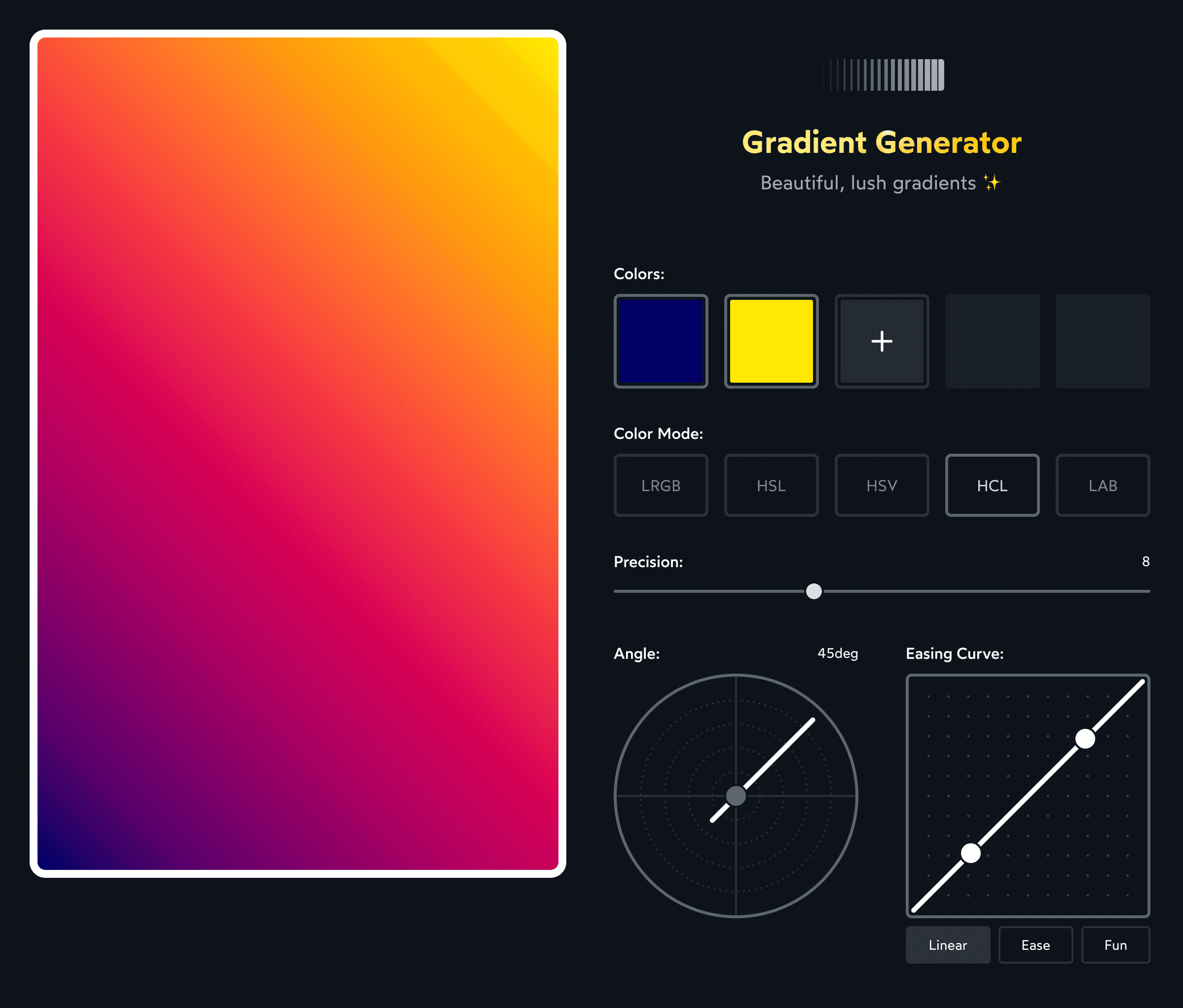
I'm really excited about this tool. It uses all the stuff we've talked about in this blog post, plus a few other nifty tricks (like using an easing curve to control the distribution of colors).
Tweak the controls until you like the result, and then copy the CSS snippet at the bottom. Right now, the tool only generates linear gradients, but you can copy/paste the set of CSS colors and use them in radial and conic gradients as well!
Check it out here:
joshwcomeau.com/gradient-generator
Oh, and one more thing: If you enjoyed this teaching style, with the interactive widgets and first-principles focus, you'll love my CSS course, CSS for JavaScript Developers(opens in new tab).

In my course, we take a similar approach to the entire CSS language. We learn how it works under-the-hood, so that the language stops feeling so dang surprising. We cover a bunch of common layouts and effects, but we focus on the underlying ideas, so that you can build any layout or effect with the tools you've learned.
If you're interested, you can learn more here: https://css-for-js.dev(opens in new tab).
Link to this headingPrior art
I was inspired to build my gradient generator after seeing these two wonderful gradient generators:
- Vivid Gradient Generator Tool(opens in new tab) by Erik Kennedy
- Polychroma(opens in new tab) by @stormwarning
Last updated on
January 11th, 2022