Like so many things in CSS, the transform property is surprisingly remarkable.
At first glance, it may seem like a pretty niche thing. How often do we need to rotate or skew something, after all? And yet, the more I learn about transform, the more I find myself taking advantage of it. In my blog's codebase, I've used the transform property more than 800 times!
In this blog post, we're diving deep into the transform property. I'll show you some of the cool and unexpected things you can do with it!
Link to this headingTransform functions
The transform property can do a whole bunch of different things, through the use of transform functions like translate and skew.
Let's look at each in turn.
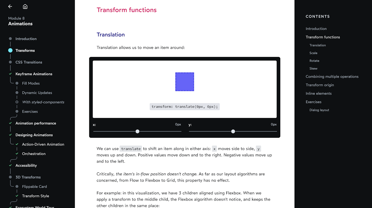
Link to this headingTranslation
Translation allows us to move an item around:
We can use translate to shift an item along in either axis: x moves side to side, y moves up and down. Positive values move down and to the right. Negative values move up and to the left.
Critically, the item's in-flow position doesn't change. As far as our layout algorithms are concerned, from Flow to Flexbox to Grid, this property has no effect.
For example: in this visualization, we have 3 children aligned using Flexbox. When we apply a transform to the middle child, the Flexbox algorithm doesn't notice, and keeps the other children in the same place:
This is similar to how top / left / right / bottom work in positioned layout, with relatively-positioned elements.
When we want to move an element along a single axis, we can use translateX and translateY:
.box {
  transform: translateY(20px);

  /* It's equivalent to: */
  transform: translate(0px, 20px);
}
There's one thing that makes translate ridiculously powerful, though. Something totally unique in the CSS language.
When we use a percentage value in translate, that percentage refers to the element's own size, not the available space within the parent container.
For example:
Setting transform: translateY(-100%) moves the box up by its exact height, no matter what that height is, to the pixel.
This is incredibly handy when we want an element to sit just outside another one:
Code Playground
Result
A common usecase for this trick is to add a "close" button just outside a dialog box:
Code Playground
Result
With the magic of calc, we can even mix relative and absolute units:
This allows us to add a "buffer", so that we can translate something by its own size plus a few extra pixels.
Link to this headingScale
Alright, let's look at another transform function!
scale allows us to grow or shrink an element:
Scale uses a unitless value that represents a multiple, similar to line-height. scale(2) means that the element should be 2x as big as it would normally be.
We can also pass multiple values, to scale the x and y axis independently:
At first glance, this might seem equivalent to setting width and height, but there's one big difference.
Check out what happens when our element has some text in it:
The text scales up and down with the element. We aren't just transforming the size and shape of the box, we're transforming the entire element and all of its descendants.
It may seem like a bummer that scale will stretch/squash the element's contents, but we can actually use this effect to our advantage. For example, check out this old-timey TV power animation:

For this animation, the squashing effect actually improves the effect!
And, if we really don't want our text to squash, we can apply an inverse transform to the child.
This is an advanced technique, far beyond the scope of this blog post, but know that it's possible to use scale to increase an element's size without distorting its children. Libraries like Framer Motion(opens in new tab) take advantage of this fact to build highly-performant animations without stretching or squashing.
Link to this headingRotate
You guessed it: rotate will rotate our elements:
We typically use the deg unit for rotation, short for degrees. But there's another handy unit we can use, one which might be easier to reason about:
The turn unit represents how many turns the element should make. 1 turn is equal to 360 degrees.
It's obscure, but well-supported; the turn unit goes all the way back to IE 9!
Link to this headingSkew
Finally, skew is a seldom-used but pretty-neat transformation:
As with translate, we can skew along either axis:
Skew can be useful for creating diagonal decorative elements (à la Stripe(opens in new tab)). With the help of calc and some trigonometry, it can also be used on elements without distorting the text! This technique is explored in depth in Nils Binder's awesome blog post, “Create Diagonal Layouts Like It's 2020(opens in new tab)”.
Link to this headingTransform origin
Every element has an origin, the anchor that the transform functions execute from.
Check out how rotation changes when we tweak the transform origin:
The transform origin acts as a pivot point!
It isn't exclusive to rotation, either; here's how it affects scale:
This is useful for certain kinds of effects (for example, an element "growing out of" another one).
Link to this headingCombining multiple operations
We can string together multiple transform functions by space-separating them:
The order is important: the transform functions will be applied sequentially. Check out what happens if we reverse the order:
The transform functions are applied from right to left, like composition in functional programming.
In the first demo, we rotate the element in its natural position, and then translate it along the X axis.
In this second demo, however, we translate the element first. When we apply the rotation, it rotates around its origin, which hasn't changed.
Here's the same demo, but with the origin shown:
We can use this to our advantage:
Code Playground
Result
In this example, we start by positioning the moon in the dead center of the planet. Our animation will shift it 80px to the right, and then cause it to rotate in a circle. Because the moon's origin is still in the center of the planet, it orbits around at a distance.
Try changing 80px in the from/to blocks to see how it affects the animation!
Link to this headingInline elements
One common gotcha with transforms is that they don't work with inline elements in Flow layout.
Code Playground
Result
Inline elements don't enjoy being jostled. Their goal is to wrap around some content with as little disruption as possible. Transforms aren't their cup of tea.
The easiest fix is to switch it to use display: inline-block, or to use a different layout mode (eg. Flexbox or Grid).
Link to this headingThe third dimension
In addition to the 2D transforms we've covered in this tutorial, CSS can transform elements in a third dimension!
3D transforms have their own quirks and idiosyncracies. In order to do them justice, I'll be writing a separate post all about 3D transforms. Stay tuned!
Link to this headingGoing deeper
I have a confession to make: this tutorial wasn't originally written as a blog post. It's been ported over from my recent CSS course:
CSS for JavaScript Developers(opens in new tab) is a comprehensive multi-format course with the goal of transforming your relationship with CSS.
The course is specifically created for folks who work with a JS framework like React or Angular or Vue. We cover the fundamentals of CSS, but within the context of the modern JS ecosystem.
It goes way deeper than my blog posts. There are over 150 videos, in addition to dozens of exercises and projects.
I've been working on it full-time for over a year now. Almost 5000 people purchased it in an early crowdfunding round, and their feedback has made the course so much better.
Learn more here: css-for-js.dev(opens in new tab).
Last updated on
January 6th, 2025