What can we learn from game developers?
- From
- Josh W. Comeau
- Reply-To
- me@joshwcomeau.com
- Sent
- October 11, 2022

This issue of my newsletter was sent to newsletter subscribers.
Sign up to receive future issues!
Why hello there!
For a while now, I've had an idea bouncing around in my head. At some point, it might turn into a blog post, but for now, I wanna share it in a rough form with y'all, as an exclusive little bonus for subscribing to the newsletter. 😄
Every morning, I play video games for about an hour. It's my favourite way to start my day. Recently I've been playing a casual rogue-lite game called Vampire Survivors(opens in new tab).
When you kill a boss in this game, it spawns a treasure chest, which rewards you with a random item. A ridiculously indulgent animation plays, to show you what you've received:
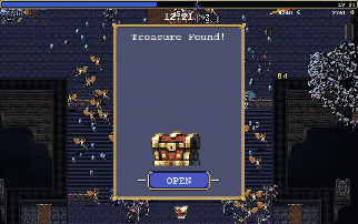
The thing I love about this is that it's so celebratory! This GIF isn't even doing it justice; I sped it up to keep the file size down, and you don't hear the music / sound effects.
Now, video games are a form of entertainment, in contrast with most web apps, which exist to help users achieve some sort of tangible goal or outcome. I use Google Calendar to create a team meeting event. I visit my banking site to pay bills. I'm not suggesting we start adding loot crates to these sorts of experiences. 😅
But I think there's a level of care and detail that is common in video games, and rarely seen on the web.
The game dev community even has a word for it: juice.
“Juice” is the extra sprinkles you add to make an experience more engaging and memorable. It could be a visual flourish, a lush animation sequence, or even a satisfying sound effect when toggling an option in the menu. It's the non-essential extras that you add, to give the game more character.
This is something I always keep in mind when I work on my own projects.
For example, a few years ago, I created Tinkersynth(opens in new tab), a generative art toy.
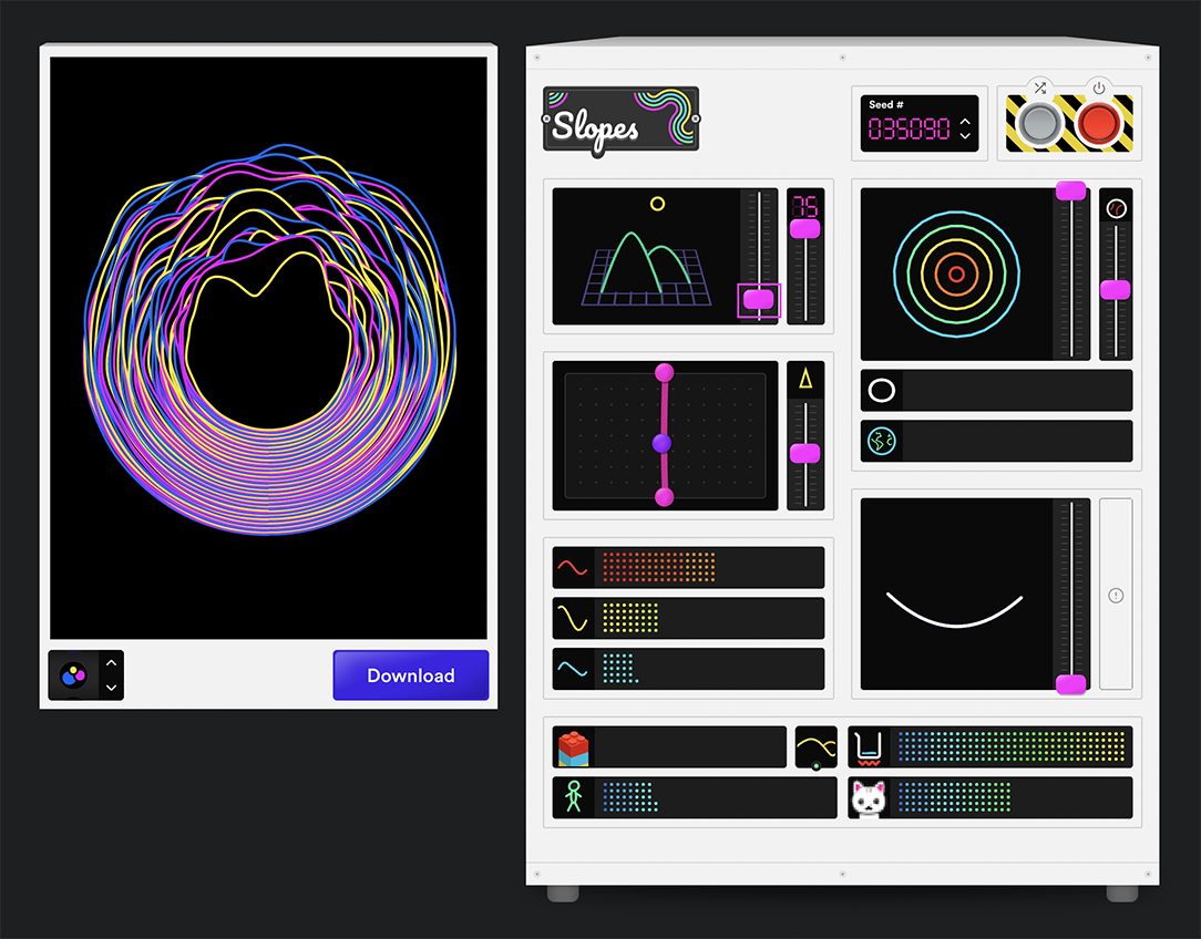
This app is statically generated, using Gatsby. The initial load is super quick, but it takes a second or two for the JS to download and be parsed.
I thought it'd be fun if the loading indicator was a mini version of the machine. Here's what I came up with:
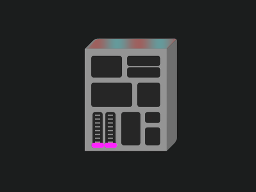
Instead of a notched spinning circle to indicate that the thing is loading, I created something totally custom. Juicy!
Now, I did break a bit of a golden rule here. The established best practice is that a loading sequence should never go on longer than necessary. The moment the code is finished loading, the user should be able to start using it!
My custom loading indicator takes 4 seconds to complete, even though the app often takes less than a second to load. But I think the effect is charming enough to warrant a couple extra seconds.
When I've told people about this in the past, I often get the following pushback:
Hang on though: it might be nice the first time you see it, but it would get old fast. By the 5th or 20th or 100th time, it'll be really annoying to spend those extra seconds waiting!
I totally agree with this! It would get old pretty quickly. Fortunately, we're software developers, and we can solve for this!
In Tinkersynth, I have the following bit of logic:
const numOfVisits = getNumberOfVisits();

let minimumLoadTime = 0;
if (numberOfVisits < 3) {
  minimumLoadTime = 4;
}
I keep track of how many times the user has visited, stored in localStorage. If they're only on their first or second visit, they get the full-fat experience, at least 4 seconds of loading animation, no matter how long it actually takes.
On the third visit and beyond, there's no artificial delay, and the app starts as soon as it's loaded.
Patterns like this are common in video games. In Vampire Survivors, for example, the devs included an escape hatch (literally): After the first couple of treasure chests, you can hit the "Escape" key to skip to the end of the celebratory animation sequence, and get back to killing vampires ASAP.
There are so many options when it comes to this stuff. We can add whimsical flourishes and also ensure they don't get annoying.
A few years ago, I gave a talk at React Europe called The Case for Whimsy. It digs deeper into some of these ideas, and I share some of the code for a few whimsical effects I've built.
Celebratory animations aside, there are so many other examples of cool things we could learn from video games.
Here's what comes to mind:
- Improved loading experiences. Many video games will add tips or useful insights to the loading screens, or provide a mini-game so you don't get bored! I took inspiration from this(opens in new tab) a while back.
- Sound effects. Audio is a huge part of most games (and even some mobile apps). Even non-game stuff like menu interactions often has sound effects. I wrote a blog post about using sound on the web(opens in new tab)!
- Physics. Even in simple 2D games, objects often have consistent physics. This makes the world feel tactile and real.
- Transitions. Hard cuts are rare in games. Screens fade out, menus rise in from offscreen.
It's common for us web developers to get inspiration from other websites; we try and reverse-engineer the cool details created by Stripe or Apple. But imagine how unique our web applications would be if we drew inspiration from an entirely different world!
The next time you're playing a video game (or watching someone playing a game), try and focus on the little details. It can be really inspiring! 😄
That's all I've got for today, but I'm almost finished a new blog post! I'll let you know when it's published ❤️
—Josh
PS. Do you have any examples of video game UX that could be awesome on the web? Reply to this email and let me know! Whether you have concrete examples from specific games, or there are broader patterns you think are worthwhile, I'd love to hear from you. 😄
This issue of my newsletter was sent to newsletter subscribers.
Sign up to receive future issues!
Interactive Courses
© 2018-present Joshua Comeau. All Rights Reserved.