Two lovely brand-new CSS properties ✨
- From
- Josh W. Comeau
- Reply-To
- me@joshwcomeau.com
- Sent
- September 14, 2026

This issue of my newsletter was sent to newsletter subscribers.
Sign up to receive future issues!
Hey folks!
CSS has gotten so many long-awaited new features over the past few years, from Container Queries to View Transitions to Anchor Positioning (which I wrote about recently!(opens in new tab)). In fact, there's been so much cool new stuff that it's easy for stuff to fly under the radar.
In this email, I want to dig into two new CSS properties that I’ve been experimenting with recently, corner-shape and border-shape. Both of them offer brand new possibilities in terms of the UIs we can build. ✨
In terms of browser support, both of these properties are hovering around the 65-70% mark, so they aren’t yet available across all modern browsers. That said, both of them are cosmetic properties that work perfectly as progressive enhancements, so I think you can absolutely start using this stuff today!
Link to this headingCSS corner-shape
The new corner-shape property allows us to pick from a set of new geometries for the corners of our DOM nodes:
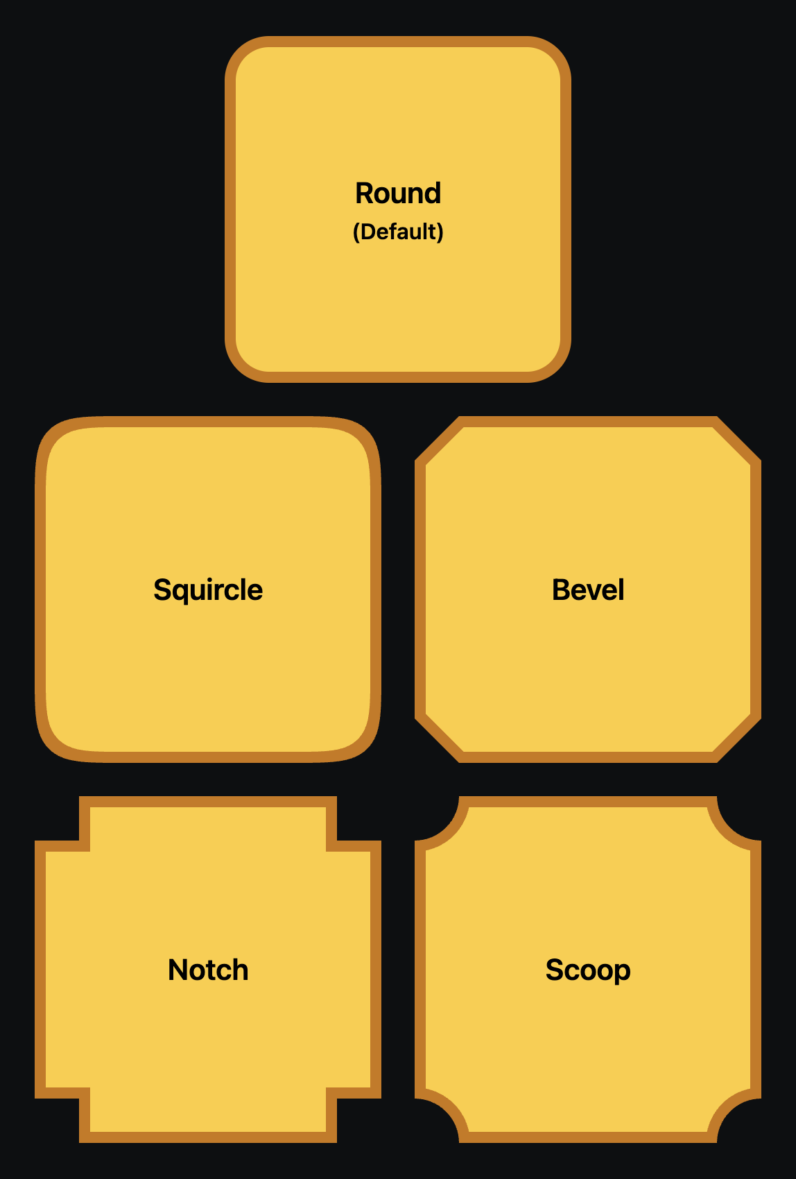
That’s right, we’re finally getting native squircles, baby! If you’re not familiar, squircles are an alternative algorithm for generating rounded corners using superellipses. Apple has been making use of them for years because they produce smoother rounded edges than the traditional “plop a quarter-circle in each corner” approach.
Admittedly, it’s a pretty subtle thing, but it’s one of those small details that, in aggregate, make a product feel polished and premium. corner-shape also provides a lower-level superellipse() function we can call with different curvature values, if we want our squircle to be sharper or rounder. ✨
The other new values are also surprisingly handy. I’ve been working on a retro-themed incremental game, and corner-shape: bevel has been incredibly useful:
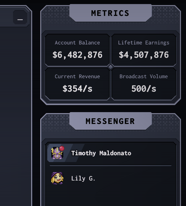
corner-shape is so powerful because it actually changes the shape of the element’s border box. This means that our borders, outlines, and box shadows will follow these new edges! This makes it way more practical than older methods of achieving these sorts of effects (eg. clip-path).
The trusty border-radius property controls how deeply-inset the beveled corners are, and we can even use the long-form syntax (8 values instead of 4) to draw the bevels at different angles! Honestly, this new property is so much deeper than I originally realized, and I can't wait to see what other new doors are opened as a result 😄. I haven’t really played with notch or scoop yet, but I bet there are some cool things we can do with them too.
corner-shape is currently available in Chromium browsers like Chrome, Edge, and Opera. It's sitting around 71% support on caniuse(opens in new tab). Given that this property is purely cosmetic, though, I think it's entirely reasonable to start using it today.
You can play with the different values in a Codepen I created(opens in new tab).
Link to this headingCSS border-shape
In addition to corner-shape, there’s an entirely separate proposal related to custom edges, border-shape. And this one is way more powerful. 😮
Instead of picking from a handful of new options, border-shape allows us to draw whatever border we like using shape(), a CSS-based alternative to SVG path syntax.
For example, I recently used border-shape to draw a border that included a circular cutout, for a coin icon I wanted to fit in that slot:
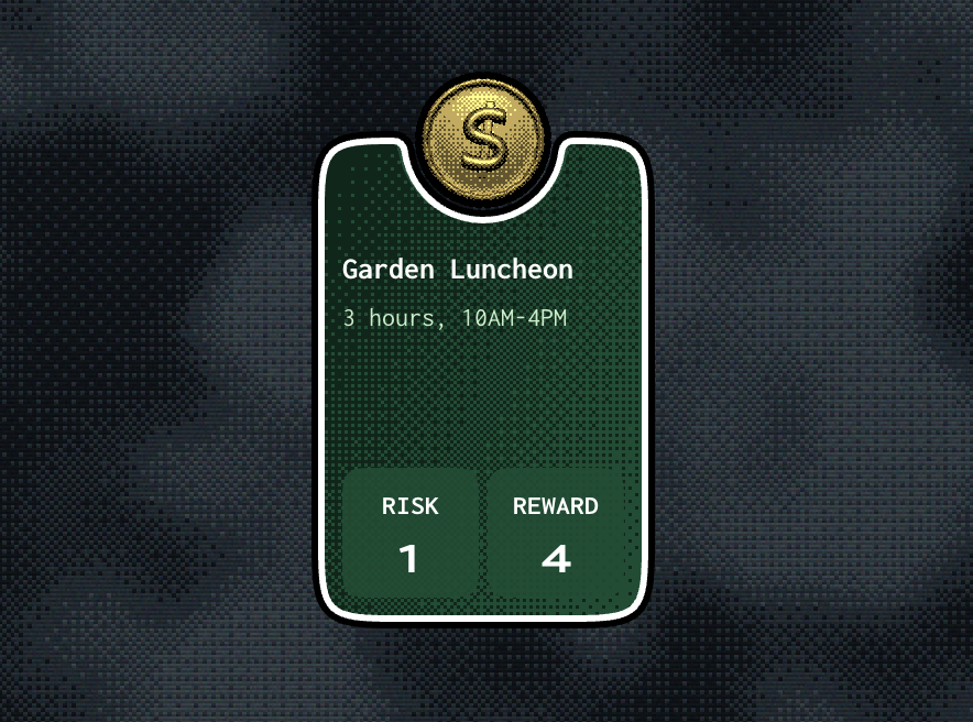
Even more remarkably, this property is transition-compatible, so we can smoothly animate between different border shapes:
(This was for a political strategy game that I was prototyping; I’ve set it to the side for now.)
Like with corner-shape, we’re not simply masking out the shape we want; we can apply borders, outlines, and box-shadows to these custom shapes! By default, content will overflow normally, but we can also mask out the border shape with trusty ol’ overflow: hidden.
This is incredibly powerful, but with great power comes great complexity 😅. Here’s the big chunk of CSS that draws this custom border:
.card {
  border-shape: shape(
    from 29px 0px,
    hline to calc(50% - 40.69px),
    arc to calc(50% - 38.71px) 1.76px of 2px cw,
    arc to calc(50% + 38.71px) 1.76px of 39px 39px,
    arc to calc(50% + 40.69px) 0px of 2px cw,
    hline to calc(100% - 29px),
    curve to 100% 29px with calc(100% - 2.64px)
      0px / 100% 2.64px,
    vline to calc(100% - 29px),
    curve to calc(100% - 29px) 100%
      with 100% calc(100% - 2.64px)
      / calc(100% - 2.64px) 100%,
    hline to 29px,
    curve to 0px calc(100% - 29px) with 2.64px 100%
      / 0px calc(100% - 2.64px),
    vline to 29px,
    curve to 29px 0px with 0px 2.64px / 2.64px 0px,
    close
  );
}
In my actual project, I have a JS function that produces this shape() string dynamically from a provided notch radius, corner radius, and fillet radius (the tiny little arcs that smooth out the otherwise-harsh transition to the notch).
I think border-shape will likely wind up being a bit like the linear() timing function; rather than writing shape() paths by hand, we’ll use tools that generate them procedurally. I can imagine a webapp that provides dozens of interesting border shapes, ready to copy/paste into your projects!
In terms of browser support, border-shape is similar to corner-shape, available exclusively in Chromium browsers(opens in new tab), but it’s currently being considered for inclusion in Interop 2027, an annual agreement from all major browser vendors to try and implement the same core set of features. You can vote for border-shape on Github by clicking the “👍” emoji on the issue.
In the meantime, I think it’s totally reasonable to start using border-shape as long as you ensure that the app is still functional on other browsers. In the case of my card cutout, for example, I would just need to make sure that everything is still fully legible without the notch.
You can check out my notched card code on Codepen(opens in new tab).
As you can probably tell from some of the screenshots in this email, I’ve had a fun summer! I’ve been experimenting with game dev, kicking around a few loose ideas. For the past month or so, I’ve locked in on an idea that I really like. It's too soon to share more than that, but I'll definitely let y’all know if/when it becomes something you can play!
That’s it for me. Hope your week is off to a good start! ❤️
PS. I have a secret lil’ coupon to share with you, CORNERS_AND_BORDERS. It will take 20% off any of my courses: CSS for JavaScript Developers(opens in new tab), The Joy of React(opens in new tab), or Whimsical Animations(opens in new tab). It’s valid for 2 weeks or 50 redemptions, whichever comes first.
I can also combine that with a bundle discount if you’d like to pick up 2 or 3 of my courses. You can reply to this email and let me know which courses you’d like. Please include a full billing address and I’ll generate an invoice for you to pay online. As long as the coupon hasn’t expired when you reach out, I'll lock in the price for you. 😄
This issue of my newsletter was sent to newsletter subscribers.
Sign up to receive future issues!
Interactive Courses
© 2018-present Joshua Comeau. All Rights Reserved.