When CSS Grid layout was first released, it came with a big asterisk: only the grid’s direct children could participate in the layout. “Subgrid” is a newer addition to CSS Grid which allows us to extend the grid layout down through the DOM tree.
When I first heard about subgrid, it seemed to me like a convenience, a way to make it a bit simpler to accomplish the same stuff I was already doing. As it turns out, subgrid is way more interesting than that. It opens whole new doors in terms of the UIs we can build!
In this tutorial, I’ll show you some of the exciting new things we can do with subgrid. Along the way, you’ll learn the basic mechanics of subgrid. We’ll even go over the most common gotchas!
Link to this headingThe fundamentals
We’ll get to the interesting stuff soon, but first, let’s start with the basics.
Suppose we want to implement the following mockup:

We can create this layout using a flat grid, no subgrid required. Here’s a quick implementation:
Code Playground
<style>
  .grid {
    display: grid;
    grid-template-columns: 35% 1fr 1fr 1fr;

    header {
      grid-row: 1 / 3;
    }
  }
</style>

<div class="grid">
  <header>
    <h1>My Portfolio</h1>
    <p>
      A small selection of the works created using Blender. No robots or AI involved.
    </p>
    <p>
      In a real artist portfolio, there would be more text here.
    </p>
  </header>
  <img alt="…" src="/img/thumb-sneakers.jpg" />
  <img alt="…" src="/img/thumb-rocket.jpg" />
  <img alt="…" src="/img/thumb-fish.jpg" />
  <img alt="…" src="/img/thumb-guitar-pedals.jpg" />
  <img alt="…" src="/img/thumb-machine.jpg" />
  <img alt="…" src="/img/thumb-particles.jpg" />
</div>
If we check the “Grid” devtools, we see that this is a 4x2 grid, with the header spanning the first two rows:

In order for this to work without subgrid, every grid participant has to be a direct child of the .grid container. Sure enough, if we inspect the HTML, we see the following structure:
<div class="grid">
  <header>
    <h1>…</h1>
    <p>…</p>
  </header>
  <img alt="…" src="/img/thumb-sneakers.jpg" />
  <img alt="…" src="/img/thumb-rocket.jpg" />
  <img alt="…" src="/img/thumb-fish.jpg" />
  <img alt="…" src="/img/thumb-guitar-pedals.jpg" />
  <img alt="…" src="/img/thumb-machine.jpg" />
  <img alt="…" src="/img/thumb-particles.jpg" />
</div>
Semantically, this feels a bit funky to me. I feel like these images should be grouped in a list, since we’re displaying a collection of portfolio pieces. Proper semantic markup will provide more context to folks using assistive technologies like screen readers, and to search engines that are trying to make sense of our page.
Unfortunately, adding this extra markup throws a wrench into the grid:
Code Playground
<div class="grid">
  <header>
    <h1>My Portfolio</h1>
    <p>
      A small selection of the works created using Blender. No robots or AI involved.
    </p>
    <p>
      In a real artist portfolio, there would be more text here.
    </p>
  </header>

  <!-- 👇 The images are grouped in an unordered list (<ul>): -->
  <ul>
    <li><img alt="…" src="/img/thumb-sneakers.jpg" /></li>
    <li><img alt="…" src="/img/thumb-rocket.jpg" /></li>
    <li><img alt="…" src="/img/thumb-fish.jpg" /></li>
    <li><img alt="…" src="/img/thumb-guitar-pedals.jpg" /></li>
    <li><img alt="…" src="/img/thumb-machine.jpg" /></li>
    <li><img alt="…" src="/img/thumb-particles.jpg" /></li>
  </ul>
</div>
Instead of having each image occupy its own grid cell, we instead cram the entire list of images into a single cell in the second column, leaving the final two columns totally empty. 😬
CSS subgrid allows us to extend the parent grid through that <ul> tag, so that each list item (containing an image) can participate in the grid layout. Here’s what that looks like:
Code Playground
<style>
  .grid {
    display: grid;
    grid-template-columns: 35% 1fr 1fr 1fr;
  }
  .grid header {
    grid-row: 1 / 3;
  }
  /* 👇 The new styles: */
  .grid ul {
    grid-row: span 2;
    grid-column: span 3;
    display: grid;
    grid-template-rows: subgrid;
    grid-template-columns: subgrid;
  }
</style>

<div class="grid">
  <header>
    <h1>My Portfolio</h1>
    <p>
      A small selection of the works created using Blender. No robots or AI involved.
    </p>
    <p>
      In a real artist portfolio, there would be more text here.
    </p>
  </header>

  <ul>
    <li><img alt="…" src="/img/thumb-sneakers.jpg" /></li>
    <li><img alt="…" src="/img/thumb-rocket.jpg" /></li>
    <li><img alt="…" src="/img/thumb-fish.jpg" /></li>
    <li><img alt="…" src="/img/thumb-guitar-pedals.jpg" /></li>
    <li><img alt="…" src="/img/thumb-machine.jpg" /></li>
    <li><img alt="…" src="/img/thumb-particles.jpg" /></li>
  </ul>
</div>
There’s a lot going on here, so let’s unpack it.
- Using
grid-columnandgrid-row, we assign the<ul>to span three columns and two rows. This is how we specify which portion of the grid we want to share with the<ul>’s descendants. We’ll dig more into this later. - Next, we apply
display: gridto the<ul>, to create a new child grid. - Finally, we pass along the row/column definitions using
grid-template-rowsandgrid-template-columns. Thesubgridkeyword is the key bit of magic that ties the two grids together, allowing each<li>to occupy its own cell in the parent grid.
When I first learned about subgrid, this is the sort of scenario I was imagining: cases where nested HTML elements like <ul> + <li> or <figure> + <figcaption> block us from assigning the actual UI elements to the grid. CSS subgrid is a nifty lil’ escape hatch for these types of situations!
That said, it's not like we haven’t had other ways to solve these kinds of problems. Instead of sharing a single CSS grid template with subgrid, we could instead combine a Flexbox row with a nested grid:
Code Playground
<style>
  /* Instead of CSS Grid, the parent uses Flexbox */
  .wrapper {
    display: flex;

    /* The first child uses 35% of the available size: */
    header {
      flex-basis: 35%;
    }

    /*
      The <ul> fills the rest of the Flex row,
      and creates a 3-column grid for its children:
    */
    .grid {
      flex: 1;
      display: grid;
      grid-template-columns: 1fr 1fr 1fr;
    }
  }
</style>

<div class="wrapper">
  <header>
    <h1>My Portfolio</h1>
    <p>
      A small selection of the works created using Blender. No robots or AI involved.
    </p>
    <p>
      In a real artist portfolio, there would be more text here.
    </p>
  </header>

  <ul class="grid">
    <img src="/img/thumb-sneakers.jpg" />
    <img src="/img/thumb-rocket.jpg" />
    <img src="/img/thumb-fish.jpg" />
    <img src="/img/thumb-guitar-pedals.jpg" />
    <img src="/img/thumb-machine.jpg" />
    <img src="/img/thumb-particles.jpg" />
  </ul>
</div>
Instead of trying to rig everything up to use a single grid structure, we can often create the same layout with nested combinations of Flexbox/Grid. And honestly, I think I prefer this approach in this case! It feels simpler to me.
But like I said earlier, this isn’t the most exciting use case for subgrid. Now that we’ve covered the basic syntax, we can explore some of the more interesting possibilities. 😄
Link to this headingNew layout possibilities
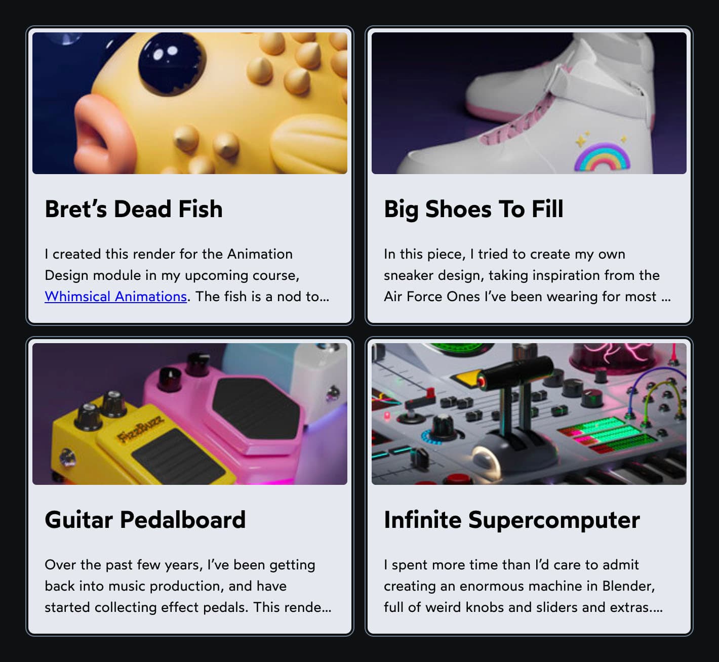
Sticking with the artist portfolio example, let’s suppose we have this card design:

Bret’s Dead Fish
I created this render for the Animation Design module in my upcoming course, Whimsical Animations(opens in new tab). The fish is a nod to Bret Victor’s talk, “Stop Drawing Dead Fish”, which is referenced in the course.
This looks alright on its own, but something funky happens when we put it in a grid:
Code Playground
<style>
  .grid {
    display: grid;
    grid-template-columns: 1fr 1fr;

    @media (max-width: 32rem) {
      grid-template-columns: 1fr;
    }
  }
  .grid article {
    display: grid;
    grid-template-columns: 2fr 1fr;
  }
</style>

<div class="grid">
  <article>
    <img
      alt="A big yellow pufferfish"
      src="/img/thumb-fish.jpg"
    />
    <div class="content">
      <h2>Bret’s Dead Fish</h2>
      <p>
        I created this render for the Animation Design module in my
        upcoming course,
        <a href="https://whimsy.joshwcomeau.com/" target="_blank"
          >Whimsical Animations</a
        >. The fish is a nod to Bret Victor’s talk, “Stop Drawing Dead
        Fish”, which is referenced in the course.
      </p>
    </div>
  </article>
  <article>
    <img
      alt="two white sneakers with pink details and a shiny sparkly rainbow"
      src="/img/thumb-sneakers.jpg"
    />
    <div class="content">
      <h2>Big Shoes To Fill</h2>
      <p>
        In this piece, I tried to create my own sneaker design, taking
        inspiration from the Air Force Ones I’ve been wearing for most of
        my adult life. Topographically, shoes are a really weird shape, so
        this was a good challenge!
      </p>
    </div>
  </article>
  <article>
    <img
      alt="three colorful guitar pedals, with foot controls and knobs"
      src="/img/thumb-guitar-pedals.jpg"
    />
    <div class="content">
      <h2>Guitar Pedalboard</h2>
      <p>
        Over the past few years, I’ve been getting back into music
        production, and have started collecting effect pedals. This render
        is my attempt to create my own pedal designs. The middle one is
        meant to look a bit like Zoidberg.
      </p>
    </div>
  </article>
  <article>
    <img
      alt="A very complicated machine with a plane-style throttle, a piano keyboard, radar, a bunch of sliders and knobs, and so much more"
      src="/img/thumb-machine.jpg"
    />
    <div class="content">
      <h2>Infinite Supercomputer</h2>
      <p>
        I spent more time than I’d care to admit creating an enormous
        machine in Blender, full of weird knobs and sliders and extras. The
        goal was to produce a completely ridiculous cockpit-style panel.
      </p>
    </div>
  </article>
</div>
Notice that the images are different widths? The fish image, for example, is much wider than the final supercomputer image. What’s going on here? 🤔
Well, let’s take a look at the CSS. The four cards are arranged in a two-column grid (which shrinks to a one-column grid on smaller screens):
.grid {
  display: grid;
  grid-template-columns: 1fr 1fr;

  @media (max-width: 32rem) {
    grid-template-columns: 1fr;
  }
}
We’re populating this top-level grid with four <article> cards. Each card declares its own two-column grid:
.grid article {
  display: grid;
  grid-template-columns: 2fr 1fr;
}
The goal here is for the image to take up the lion’s share of the space within each card, since that’s the important part (the point of an artist’s portfolio, after all, is to showcase the art!). But the fr unit is designed to be flexible; it will try to match the requested ratio, but it’ll adapt based on the content.
This is actually a very good thing. We could force the image column to be a fixed size, but we wouldn’t like the results:
Code Playground
<style>
  .grid {
    display: grid;
    grid-template-columns: 1fr 1fr;

    @media (max-width: 32rem) {
      grid-template-columns: 1fr;
    }
  }
  .grid article {
    display: grid;

    /* 👇 This is the change 👇 */
    grid-template-columns: 66% 1fr;
  }
</style>

<div class="grid">
  <article>
    <img
      alt="A big yellow pufferfish"
      src="/img/thumb-fish.jpg"
    />
    <div class="content">
      <h2>Bret’s Dead Fish</h2>
      <p>
        I created this render for the Animation Design module in my
        upcoming course,
        <a href="https://whimsy.joshwcomeau.com/" target="_blank"
          >Whimsical Animations</a
        >. The fish is a nod to Bret Victor’s talk, “Stop Drawing Dead
        Fish”, which is referenced in the course.
      </p>
    </div>
  </article>
  <article>
    <img
      alt="two white sneakers with pink details and a shiny sparkly rainbow"
      src="/img/thumb-sneakers.jpg"
    />
    <div class="content">
      <h2>Big Shoes To Fill</h2>
      <p>
        In this piece, I tried to create my own sneaker design, taking
        inspiration from the Air Force Ones I’ve been wearing for most of
        my adult life. Topographically, shoes are a really weird shape, so
        this was a good challenge!
      </p>
    </div>
  </article>
  <article>
    <img
      alt="three colorful guitar pedals, with foot controls and knobs"
      src="/img/thumb-guitar-pedals.jpg"
    />
    <div class="content">
      <h2>Guitar Pedalboard</h2>
      <p>
        Over the past few years, I’ve been getting back into music
        production, and have started collecting effect pedals. This render
        is my attempt to create my own pedal designs. The middle one is
        meant to look a bit like Zoidberg.
      </p>
    </div>
  </article>
  <article>
    <img
      alt="A very complicated machine with a plane-style throttle, a piano keyboard, radar, a bunch of sliders and knobs, and so much more"
      src="/img/thumb-machine.jpg"
    />
    <div class="content">
      <h2>Infinite Supercomputer</h2>
      <p>
        I spent more time than I’d care to admit creating an enormous
        machine in Blender, full of weird knobs and sliders and extras. The
        goal was to produce a completely ridiculous cockpit-style panel.
      </p>
    </div>
  </article>
</div>
On certain viewport sizes, the cards simply aren’t large enough to devote ⅔rds of the available space to the image and still contain the text content. If we force that column to have a fixed size, the text could wind up overflowing:

So, the flexibility we get from the fr unit is a good thing. The problem is that each card is doing its own internal calculation. The heading in the first card (“Bret’s Dead Fish”) is made up of small words, so it can fit comfortably in a narrow column. But the final card’s heading (“Infinite Supercomputer”) requires quite a bit more room.
If you’ve worked with CSS for a while, you’ve probably gotten stuck in cul-de-sacs like this. One of the hardest problems in CSS is when siblings need to be aware of each other inside nested / complex layouts.
Miraculously, subgrid offers a solution to these sorts of problems. Check this out:
Code Playground
<style>
  .grid {
    display: grid;
    grid-template-columns: repeat(2, 2fr 1fr);

    @media (max-width: 32rem) {
      grid-template-columns: 2fr 1fr;
    }
  }
  .grid article {
    grid-column: span 2;
    display: grid;
    grid-template-columns: subgrid;
  }
</style>

<div class="grid">
  <article>
    <img
      alt="A big yellow pufferfish"
      src="/img/thumb-fish.jpg"
    />
    <div class="content">
      <h2>Bret’s Dead Fish</h2>
      <p>
        I created this render for the Animation Design module in my
        upcoming course,
        <a href="https://whimsy.joshwcomeau.com/" target="_blank"
          >Whimsical Animations</a
        >. The fish is a nod to Bret Victor’s talk, “Stop Drawing Dead
        Fish”, which is referenced in the course.
      </p>
    </div>
  </article>
  <article>
    <img
      alt="two white sneakers with pink details and a shiny sparkly rainbow"
      src="/img/thumb-sneakers.jpg"
    />
    <div class="content">
      <h2>Big Shoes To Fill</h2>
      <p>
        In this piece, I tried to create my own sneaker design, taking
        inspiration from the Air Force Ones I’ve been wearing for most of
        my adult life. Topographically, shoes are a really weird shape, so
        this was a good challenge!
      </p>
    </div>
  </article>
  <article>
    <img
      alt="three colorful guitar pedals, with foot controls and knobs"
      src="/img/thumb-guitar-pedals.jpg"
    />
    <div class="content">
      <h2>Guitar Pedalboard</h2>
      <p>
        Over the past few years, I’ve been getting back into music
        production, and have started collecting effect pedals. This render
        is my attempt to create my own pedal designs. The middle one is
        meant to look a bit like Zoidberg.
      </p>
    </div>
  </article>
  <article>
    <img
      alt="A very complicated machine with a plane-style throttle, a piano keyboard, radar, a bunch of sliders and knobs, and so much more"
      src="/img/thumb-machine.jpg"
    />
    <div class="content">
      <h2>Infinite Supercomputer</h2>
      <p>
        I spent more time than I’d care to admit creating an enormous
        machine in Blender, full of weird knobs and sliders and extras. The
        goal was to produce a completely ridiculous cockpit-style panel.
      </p>
    </div>
  </article>
</div>
How cool is this?? 🤯
In the original version, the parent grid was a one-column layout (on smaller screens), and it contained a bunch of independent grids. In this new version, the parent grid holds the two-column layout:
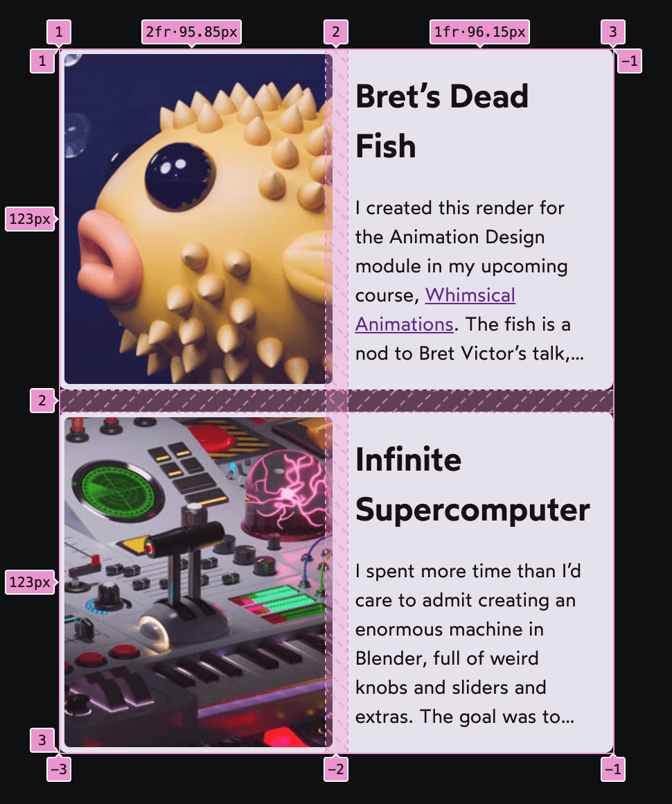
In the original version, the parent grid was a two-column layout, with each card assigned to a grid cell. In this new version, the parent grid grows to four columns:

Each <article> will span two of these columns (grid-column: span 2), and inherits the column definitions from the parent (grid-template-column: subgrid).
As a result, the grid can dynamically react to content changes. Try erasing the word “Supercomputer” in the playground above and notice how the columns readjust!
As a result, the grid can dynamically react to content changes. If that final card (“Infinite Supercomputer”) had a shorter title, the whole grid would rearrange, shrinking the text columns and allowing more of the images to be shown.
Honestly, I’m not really used to thinking about layouts like this. Before subgrid, I might’ve solved this problem by picking a very narrow fixed width for the image column, so that there was always enough space for the text column. This would ensure that the layout never breaks, but remember, the goal of a portfolio is to display as much of the images as possible! Subgrid allows us to adapt to the content dynamically, so that we can produce the best possible UI in various contexts.
This is where subgrid truly shines, in my opinion. By extending the grid downwards, it means that we can allow siblings to become responsive to each other, in a way that hasn’t been possible until now. ✨
Link to this headingSubgrid Gotchas
As I’ve been experimenting with subgrid, there have been a couple of things that have caught me off guard. Let’s go over them, so that you’ll be well-prepared!
Link to this headingReserving space for the subgrid
Sharing columns with subgrid tends to be pretty intuitive, but things get a bit more quirky when sharing rows.
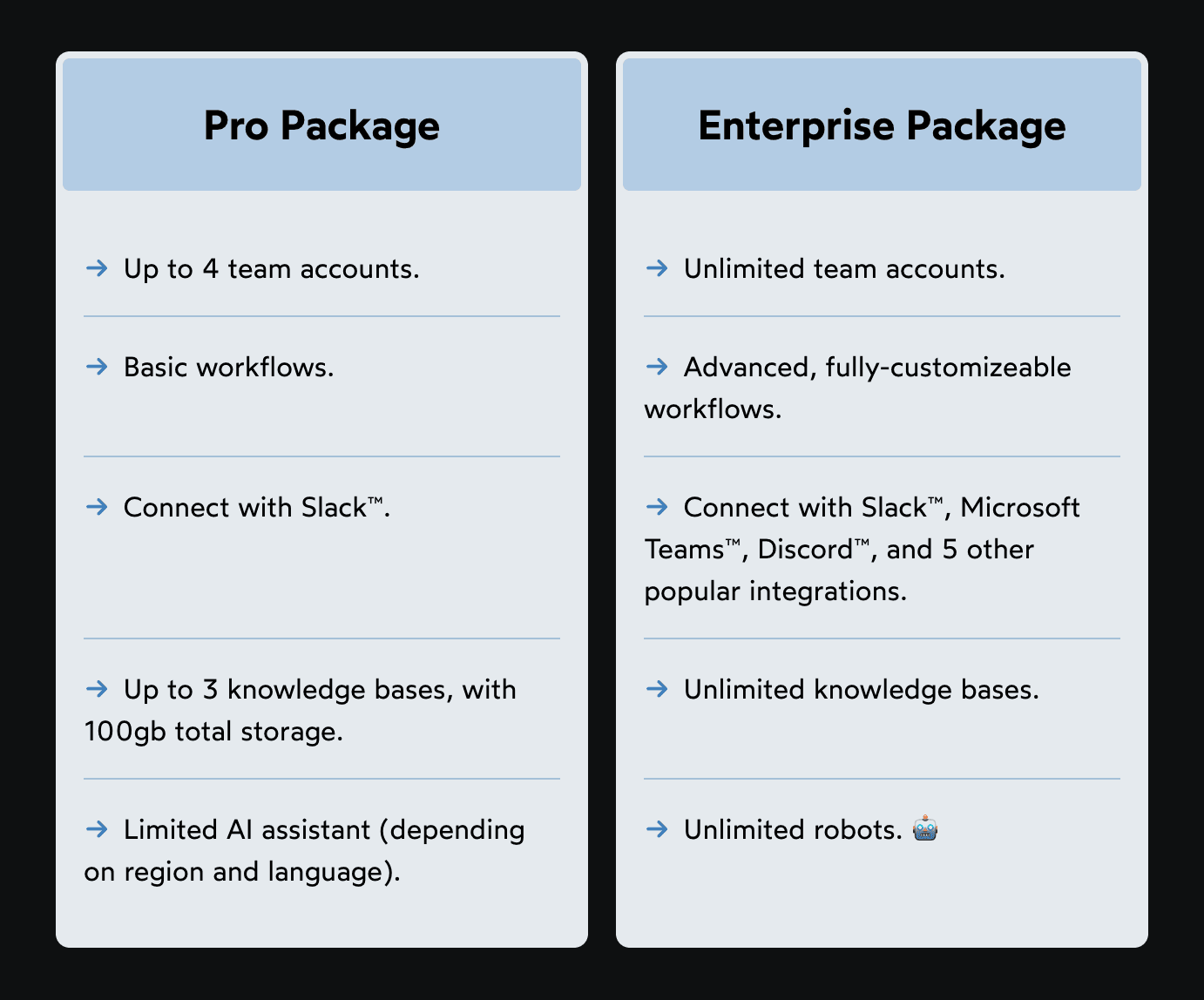
To help me explain, let’s look at a different example. Suppose our design team wants us to build the following pricing UI, to show the features included at different price tiers:
This seems like a pretty straightforward task, but the devil is in the details. If we use a typical Grid or Flexbox strategy, we’ll wind up with asymmetrical rows:
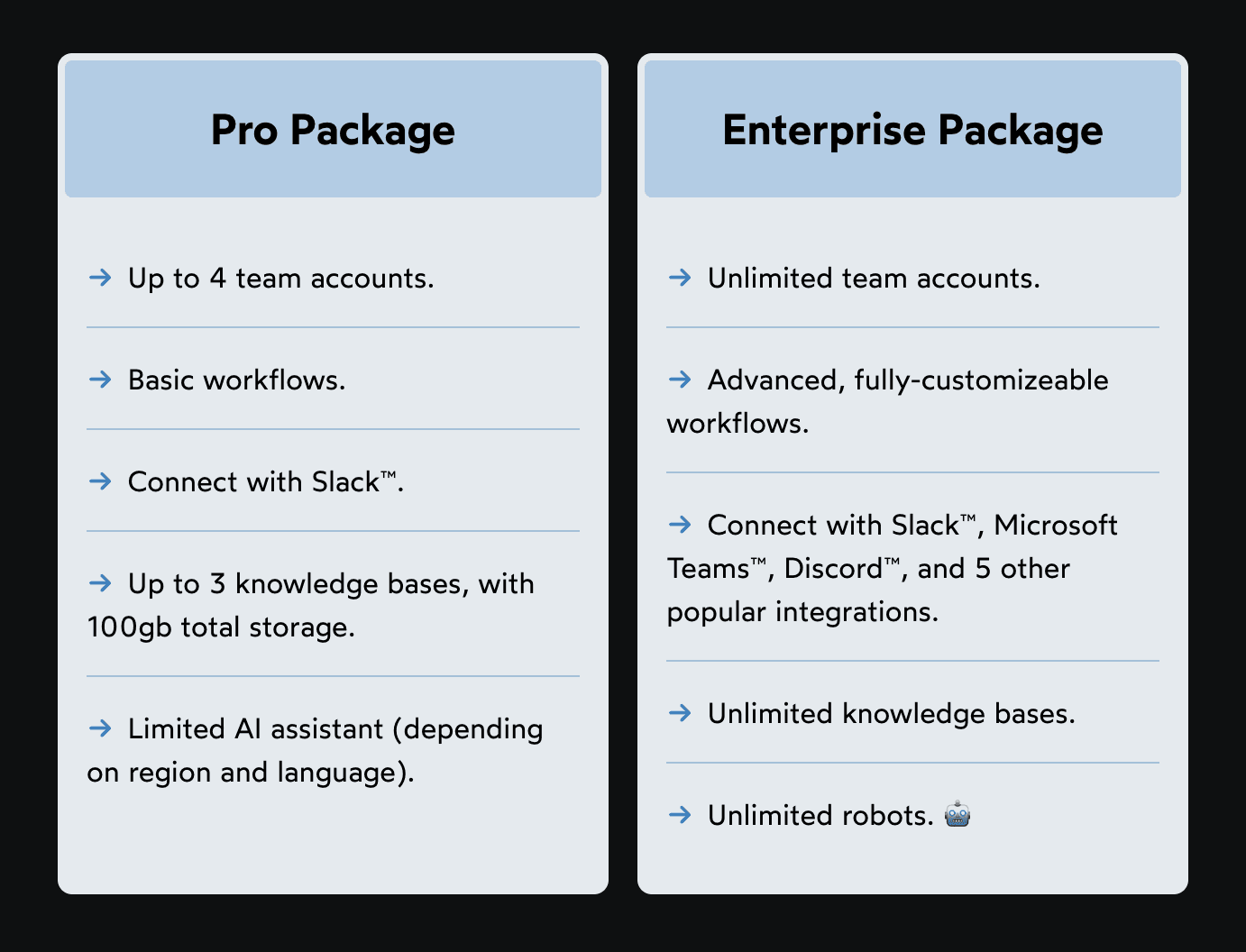
This might look right at a quick glance, but notice how the features don’t line up. In the original mockup, the first line of every feature is perfectly aligned with the same feature in the opposite card!
Historically, the only way to achieve this sort of thing in CSS has been with Table layout (using <table> tags, or display: table). It’s not really practical to use a table here, though, since we’d need each card to be its own column in the same table, and we can’t easily style table columns.
Subgrid to the rescue! At least in theory, we should be able to let both cards share a single grid, like this:
Unfortunately, there’s a very easy mistake to make. See if you can spot the problem with this code:
Code Playground
<style>
  .grid {
    display: grid;
    grid-template-columns: 1fr 1fr;

    .card, .card ul {
      display: grid;
      grid-template-rows: subgrid;
    }
  }
</style>

<div class="grid">
  <div class="card">
    <h2>Pro Package</h2>
    <ul>
      <li>Up to 4 team accounts.</li>
      <li>Basic workflows.</li>
      <li>Connect with Slack™.</li>
      <li>Up to 3 knowledge bases, with 100gb total storage.</li>
      <li>Limited AI assistant (depending on region and language).</li>
    </ul>
  </div>
  <div class="card">
    <h2>Enterprise Package</h2>
    <ul>
      <li>Unlimited team accounts.</li>
      <li>Advanced, fully-customizeable workflows.</li>
      <li>Connect with Slack™, Microsoft Teams™, Discord™, and 5 other popular integrations.</li>
      <li>Unlimited knowledge bases.</li>
      <li>Unlimited robots. 🤖</li>
    </ul>
  </div>
</div>
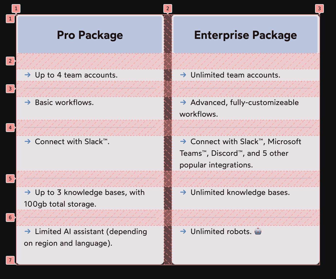
All of the text is clumped up in the same spot! If we inspect this using the Grid devtools, we discover that we’ve wound up with a 2×1 grid. All of the content within each card is smushed into a single row. 😬
Typically, with CSS Grid, we don’t need to explicitly define any rows. I usually define the number of columns, and trust the grid algorithm to add new rows as-needed, so that each child gets its own grid cell.
Unfortunately, with subgrid, it doesn't quite work like this. By default, our child grid will only span a single grid column/row. If we want it to occupy multiple rows, we need to reserve them explicitly.
Here’s what the fix looks like:
Code Playground
<style>
  .grid {
    display: grid;
    grid-template-columns: 1fr 1fr;

    .card {
      /* Instruct the .card to span across 6 rows: */
      grid-row: span 6;
      display: grid;
      grid-template-rows: subgrid;
    }
    .card ul {
      /* Instruct the list within to span across 5 rows: */
      grid-row: span 5;
      display: grid;
      grid-template-rows: subgrid;
    }
  }
</style>

<div class="grid">
  <div class="card">
    <h2>Pro Package</h2>
    <ul>
      <li>Up to 4 team accounts.</li>
      <li>Basic workflows.</li>
      <li>Connect with Slack™.</li>
      <li>Up to 3 knowledge bases, with 100gb total storage.</li>
      <li>Limited AI assistant (depending on region and language).</li>
    </ul>
  </div>
  <div class="card">
    <h2>Enterprise Package</h2>
    <ul>
      <li>Unlimited team accounts.</li>
      <li>Advanced, fully-customizeable workflows.</li>
      <li>Connect with Slack™, Microsoft Teams™, Discord™, and 5 other popular integrations.</li>
      <li>Unlimited knowledge bases.</li>
      <li>Unlimited robots. 🤖</li>
    </ul>
  </div>
</div>
The extra-complicated thing about this setup is that we’re extending the grid down two layers:
- First, we extend it to
<div class="card">, which includes an<h2>and a<ul>. - Next, we extend it to that child
<ul>, so that the individual list items each get their own row.
There are 5 list items in this case, which means we need 6 rows total (one for the heading, five for the list). If we don’t “reserve” all of these rows explicitly, then the browser will shove everything into a single row and make a big mess, like we saw above.
This is mind-bending stuff, but it becomes intuitive with a bit of practice. The thing to keep in mind is that subgrids, by default, will only occupy a single grid cell. In order to spread a group of items across multiple grid rows, the subgrid must first stretch across that area itself.
Link to this headingNested grid numbers
We got the gnarliest gotcha out of the way first! I promise the next two won’t be as intellectually taxing. 😅
In CSS grid, the lines between each column are numbered, and we can assign grid children using these numbers. This is something we explore in greater depth in “An Interactive Guide to CSS Grid”:
When we inherit a portion of the grid using grid-template-rows: subgrid or grid-template-columns: subgrid, the line numbers get reset.
Here’s an example of what I’m talking about:
Code Playground
<style>
  .grid {
    display: grid;
    grid-template-columns:
      repeat(4, 1fr);
    grid-template-rows:
      repeat(4, 1fr);

    .subgrid {
      grid-column: 2 / 5;
      grid-row: 2 / 5;
      display: grid;
      grid-template-columns: subgrid;
      grid-template-rows: subgrid;

      .child {
        grid-column: 2;
        grid-row: 2;
      }
    }
  }
</style>

<div class="grid">
  <div class="subgrid">
    <div class="child"></div>
  </div>
</div>
Our yellow .child is assigned to grid-column: 2 and grid-row: 2, but it winds up sitting in the third of the grid’s four rows and columns. 🤔
It turns out that while the grid template is inherited with subgrid, the line indexes don’t. Our .subgrid grid inherits columns/rows 2 through 4, but internally, they get re-indexed as 1 through 3.
We can see this using the grid devtools in the Elements inspector:

In my mind, I had been thinking of line numbers as unique IDs, and so I figured that if the subgrid is inheriting the grid template, those IDs would come along for the ride too. But if we think of these line numbers as indices rather than IDs, this behaviour makes a lot more sense. In every grid, the first line has index 1, even if that row/column is inherited from a parent grid.
Link to this headingIncompatibility with fluid grids
Perhaps the most famous grid snippet is this lil’ guy:
.grid {
  display: grid;
  grid-template-columns: repeat(auto-fill, minmax(100px, 1fr));
}
This is a fluid design concept. Instead of specifying different grid templates at different viewport sizes using media queries, we specify that we want as many columns as possible, as long as they’re all at least 100px wide (or whatever the minimum specified size is).
Try resizing the “Result” pane by dragging the vertical divider, and notice how the columns adjust:
Code Playground
<style>
  .grid {
    display: grid;
    grid-template-columns:
      repeat(
        auto-fill,
        minmax(100px, 1fr)
      );
  }
</style>

<div class="grid">
  <div class="child">A</div>
  <div class="child">B</div>
  <div class="child">C</div>
  <div class="child">D</div>
  <div class="child">E</div>
  <div class="child">F</div>
</div>
This is a very cool approach, but unfortunately, it doesn’t quite work with some of the new UI possibilities introduced by subgrid. For example, the “portfolio card” grid we explored earlier requires that we list the specific number of columns. We can’t use auto-fill or auto-fit.
(Or, more accurately, I haven’t found a way to use fluid design in conjunction with that subgrid pattern. If you’ve found a solution, please let me know on Bluesky!(opens in new tab))
Link to this headingSupporting older browsers
Subgrid has been supported across all major browsers since 2023. Surprisingly, though, subgrid support still hasn’t hit 90% yet (according to caniuse(opens in new tab), as of November 2025).
This presents a bit of a challenge. As we’ve seen in this blog post, subgrid enables us to solve problems that were previously unsolvable. What should we do for folks who visit using older browsers?
Well, we can’t produce an identical experience, but I think with a bit of creative problem-solving, we can come up with alternative layouts that are good enough. Using the artist portfolio example from earlier, we could reconfigure the card layout so that the image is stacked vertically, rather than horizontally:
We can accomplish this using feature queries. Here’s what the code looks like:
@supports not (grid-template-columns: subgrid) {
  .grid article {
    grid-template-columns: 1fr;
    grid-template-rows: 140px 1fr;
  }
}
Alternatively, I could have kept the two-column layout but restricted the image column’s width (eg. grid-template-columns: 50px 1fr). This would’ve preserved the original design for everyone. But I think when it comes to fallbacks, the goal isn't to be as similar to the original as possible, the goal is to produce the best experience possible. In this particular case, I think a single-column fallback experience works better.
Link to this headingIn conclusion
One of the coolest websites I’ve seen in a while is Stripe’s developer site(opens in new tab).
If we pop open the grid devtools, we see that the entire layout is one big grid, passed down through several layers of subgrids:
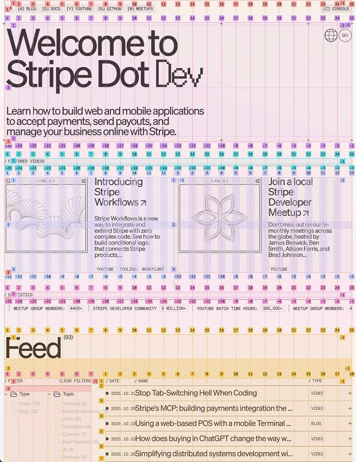
This is incredibly cool, and I think it’s a great demonstration of the maximalist things we can do with subgrid. But, honestly, I think I’m more excited by the smaller-scale stuff we’ve seen in this blog post. 😅
Subgrid is a very versatile new tool, and it can be a bit intimidating and overwhelming, but hopefully this post has given you some ideas for the sorts of things you can start experimenting with. The good news is that you don’t have to re-architect your entire project in order to start using subgrid! The most powerful parts of subgrid are things which can be incrementally adopted.
If you enjoyed this post and would like to continue learning about CSS from me, you might be interested in my course, CSS for JavaScript Developers(opens in new tab). It’s a multi-format comprehensive tour of the entire CSS language.
Another special thanks to Kevin Powell. The examples in this blog post would’ve been far less compelling without his inspiration. 😄
Last updated on
December 9th, 2025